Abstract
Movies are stories that convey the viewer to intensely experiment deep-rooted emotional messages. Film contents are predominantly delivered through vision and audition perceptive channel senses, with a wide gamma of colour sets and sound atmospheres managed to create moods, able as well to generate equilibrium awareness effects, as motion pictures glide through our attention. They can trigger emotions, thoughts and memories, derived of personal ecosystem attention structures. Distinct behaviours at the message interpretation are predisposed by cultural antecedents, validation associations and a reflection of individual emotions. Communication is a process of interaction, that leads the individual to establish perceptual and cognitive relationships with the transmitted message, such as: sensing, selecting and signifying. Therefore, meanings generated by the movie scene unravelling can be enhanced by detailed scenic cinema photography composition, as well through electing specific hue palette, saturation and brightness on image implementation, features that drive to conform an involving narrative, modulating the communication space mediation on movie creation. The semiotic field understanding, at cinema photography aesthetics and color-grading, bring about new insights of how to achieve meaningful messages, that can produce enjoyment and connection between people, within the cinematic masterpiece.
Keywords: Perception, Meaning, Interaction, Communication Space, Enjoyment.
Initial considerations
Context outline
The current essay recognizes several communicational tools used in cinema content creation, with the purpose of their further employment on image projection production at the project we are currently developing. The project “Art in the Fruition of Place: social well-being through interactive installations” promotes solutions addressing identified critical problems of contemporary cities, as verified a separation increase between people and emotional detachment from the place they live in.
This actions are promoted by the atelier Delight Design and the research group P&P “Praxis and Poiesis: from arts practice towards art theory” of University of Aveiro, in association with research group LUME “Unexpected media lab” of University of Porto, both groups from ID+ “Research Institute for Design, Media and Culture”. The project’s program aims to the production of interactive installations to strengthen ties between individuals, from these with the territory and, consequently, the growth of social emotional well-being, promoting the populations approaching. For this purpose, is developed content adjusted to the modulation of the specific artistic space to increase the place enjoyment and the interpersonal connection. In its scope, the documentation research carried out indicates that at interaction links of emotional attraction are created through participation, achieved through: Sensing, Selecting and Signifying. We ask whether interactive installations, that incorporate sensory stimuli with contents that individuals feel more appeal / affinity, will provide the desired beneficial effects. For this purpose, the contents to be used: forms; colors; images; sounds; textures, are attained from questionnaires, that identify the identity legacy of a population, adapting the Delphi inquiry method, initially focusing on an individual’s sample of Vera-Cruz, Aveiro. Subsequently, the data acquired is submitted to validation and discussion in a focus group, composed by the project’s proponent researchers, to understand which elements will contribute for the interaction content creation at the installations, that will be implemented in municipality spaces. However, considering how to make use of the elements collected for the content production, emerges the necessity of understanding the best practices related to projected image calibration. From image projection analysis, arises the appreciation of production techniques that cinema utilizes to create emotional bonds within people that watch its artistic works. Accordingly, is understood of great importance to comprehend the techniques behind the meanings generated by the movie scene unravelling, enhanced by detailed scenic cinema photography composition, along with the specifics selection of hue palettes, saturation or brightness on image implementation, features that drive the conformation of involving narratives, modulating the communication space mediation on movie creation.
Scope of the article
The starting point for a great film is always a good story. A movie is concerned to rise somehow, someway, some kind of emotion into the ones that see it. Its narrative establishes the way events unfold, whether being closer to reality, either fictional or even experimental, launching ideas, indications and messages that pass through the viewer’s imagination. This account of events takes place in a certain time and space often divergent than of the viewer´s, catapulting him into worlds where characters develop their action. Yet, a good story is not enough, the plot must be told. For this effect, movies predominantly depend of two human perceptive channels, vision and hearing, privileging the first one. Images and sounds set together a gamma of stimulus that allow messages to be delivered to our brain. They create environments, set moods, conform concepts and promote occurrence of emotions. Additionally, there are cinematic approaches that intervein in other perceptive channels with the introduction of fragrances, or seats that kinetically react to the film, taking the virtual world of cinema to extra concept levels. These supplementary interactive layers are given as been first introduced in a Czech comedy, “Kinoautomat” (Činčera 1967) one of the first theatrical interactive movie ever created, in which the audience selected what should occur pressing buttons (Figure 1).
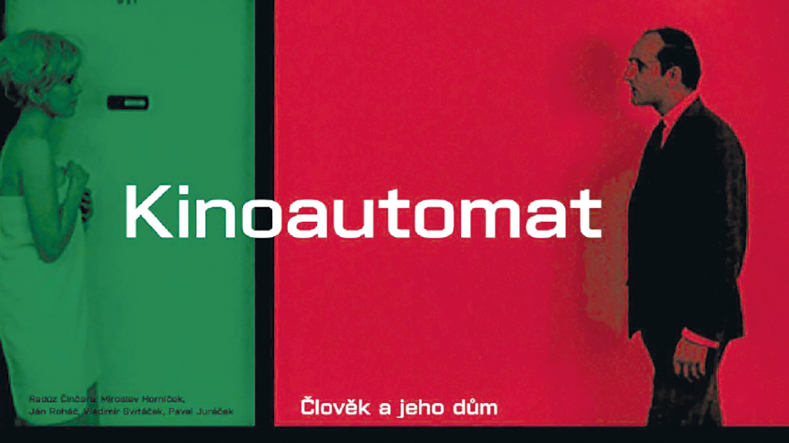
Figure 1 – One the first theatrical interactive movie ever created at Czech Republic
(image source: Virtual Illusion blog 2016).
Likewise, contemporaneously we can find interactive movies where the audience decides, in real time, the film unfolding, or its closure, intervening in determined moments and adjusting the narrative to their wills, as in “Late Shift” (Weber, Johnson et al., 2017) where the story can be changed as the interlocutor discovers new twists and turns of the story (Figure 2). Furthermore, the interactive cinema can mix the playful world of games within the cinematographic world, by inputting motion replies, in reaction to spectator movements as seen in “Asteroid Storm” (O2’s Media Agency, 2009). As well, we can find utilization of 360/VR googles, as in the short “Conscious Existence” (Zimmermann, 2018) where the audience can immerge in a collective voyage (Figure 3).

Figure 2 – Late Shift is a movie in which the spectator can chose, between two icons, the story course
(image source: Late Shift 2017).

Figure 3 – At “Conscious Existence”, a virtual journey is collectively experienced by audience
(image source: R&D Filmakademie 2018).
These divergent cinematic approaches, that intervein at supplementary perceptive channels compared to the cinephile more common two, are of great interest for the project to be carried out, for the production of interactive installations. However, that is not the focus of the present text reflection, as overreaches the regular scope of film production. The hereby stated research seeks primarily to understand the use of images as a vehicle for inducing emotional states, trying to emphasis in the ways that the imagetics mould behaviours at interaction process. Being aware of the importance of sounds at introducing atmosphere layers that manage to generate environments, they can set determined ambiences that constrain the images unfolding. Nonetheless, they prepare the space for the main cinema message delivery, the motion pictures. Therefore, images have the key role in cinema, unveiling the action and showing the details that disclose the story.
For the current project “Art in the Fruition of Place: social well-being through interactive installations” achieve a social emotional positive growth, is understood that the proposal of interactive installations construction must envision the inclusion of elements foreseen to introduce accurate stimulus. The best practices of image use can be learned by observation the arts of Photography and Cinema, areas where Image Science have already a long path made. Moreover, to produce images that define certain contexts and set certain emotional moods we must contemplate the necessity to adjust some elements realized as essential. On one hand, is seen of most importance the inclusion of identity legacy components, plenty of heritage characteristics, that set environments and make bridges between memory and usability, extensively influencing the communication process. On other hand, the use of technics provided by Cinema Photography, that reaches out the application of structural components, transversal to other arts such as painting, illustration and conventional photography. Although movies mostly succeed as a one-way media, in which viewers drown up the content provided, it is nevertheless an interaction process between spectator and art form, which we must contemplate, as several essential components used at on cinema creation can be also taken into account to produce enhanced content at interactive art installations. Adjusting elements as Image Composition, Hue Palettes, Colour Balance or Light Balance, can introduce new layers of information, when setting them up accordingly to patterns expected to create determined environments. This can be realised while discovering a vivid interactive art installation as “Au-delà des limites” (TeamLab 2018) where all the participants move freely and find through their bodies, creations transcending boundaries between people and artwork, in an immersive colorfull world.
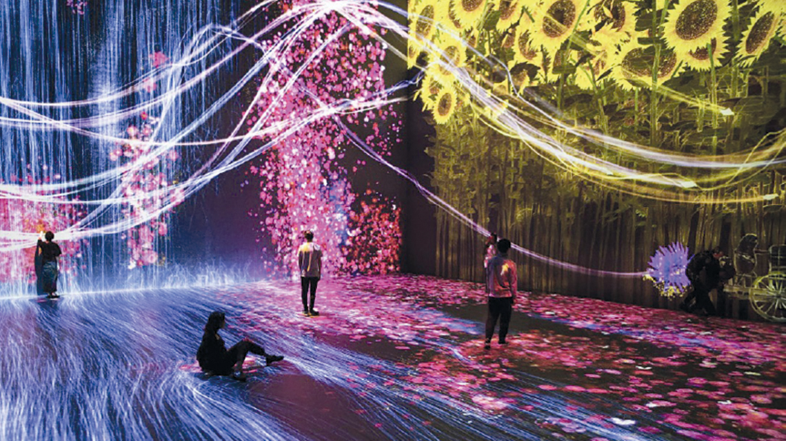
Figure 4 – This immerse installation uses memory elements and an accurate image and color creation
(image source: TeamLab 2018).
This is of absolutely importance, since images that incorporate factors foreseen of characterize determined cultural contexts and beautifully arranged to deliver the message, leads the individual to establish perceptual and cognitive connection relationships at the interactive process. Ideas and identities anchored to the nature of matters, the utilization of different gradients of colors, allowing the introduction of emotional environments that encourage participatory exploration behaviours, as well as stimulate curiosity and the willingness to share with others. The communication specific space modulation can improve the individual’s reconnection environment.
Moreover, is possible to encounter works as the intense multimedia environment “Flow” (Le Sourd 2016) an immersive interactive installation inspired by the natural phenomenon of the tides. Project on the walls, nature is represented through waves of real time data, in a random system creation process, set as an open form that offers various option combinations to the person that interacts within (Figure 5). All the content is designed and run at real time. The idea is to generate a system with an arbitrary creation process, as every time the interaction process occurs, the installation varies with unique and inimitable shapes and image forms. This art installation is complemented with sound design interpreting the visual scenery into a sonic experience, emerging the individuals at a phenomenon voyage.

Figure 5 – The content is made through people interaction creating at real time projected environments
(image source: Le Sourd 2016).
Similarly, relevant the reference of “In Order to Control” (Note Bene Visual 2011), an art installation made by a multidisciplinary studio based in Istanbul, specialized in digital video mapping experiences, installations and interactive experiences. At this interesting intervention (Figure 6), a text discussing control, ethics and morality is projected on the floor. When a person steps on the typographical area to read it, perceive that its silhouette becomes projected on the wall delimiting the text they initially intended to read, briefly losing sensitive control, bringing a control debate as the interaction begins.

Figure 6 – A text about control is floor projected, when stepped the body converts on the text
(image source: Note Bene Visual 2011).
Short overview of image projection
At films, events unfold along a timeline, applying motion to still photograms, usually covering 24 to 30 frames in a single second, enough for the human eye perceive a kinetic continuum of shapes. Light plays a decisive role in the ways we see the world, being a vehicle for the propagation of ideas that eyes catch. The study of optics and image projection originated in China with Mo Di (470-390 BC), as well known as Mozi 墨子. An artisan and polymath that excelled in making unusual devices (Figure 7), being able to form an inverted and focused image when light passed through a pinhole. He was the first to accurate theorize about light, a century before the Euclid optics understandings (Purtle 2018).
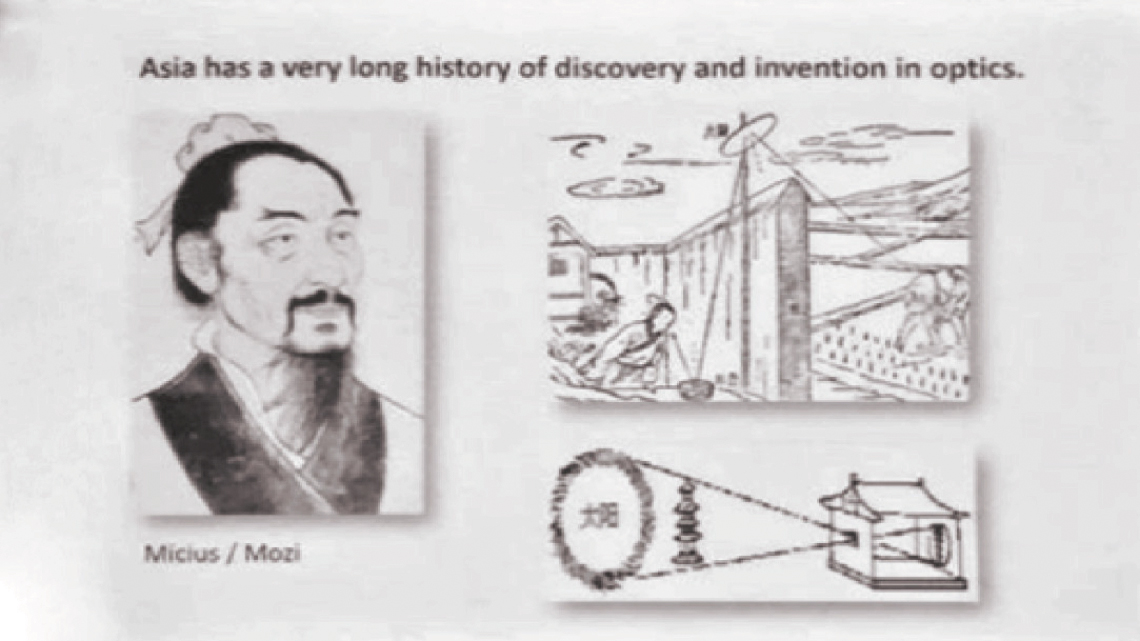
Figure 7 – Illustrations of the light experiments that Mo DI undertook, being the first to capture projected image
(image source: Liu 2018).
The “Camera Obscura” was invented by Ibn Al-Haytham (965-1039 BC), Basra originary, also known as Alhazen, using an identical method from Mo Di, however inside a dark closed space. Through a pinhole in a window blind, he was able to form and capture an inverted image of an outside scene on the opposite wall of the enclosure space (Figure 8). His book of Optics “Kitab al-Manazir” brought new ideas that influenced scholars of European Renaissance, as many consider him today as the “Father of modern Optics”, with advances in science, technology and medicine spread from Spain to China (Syed 2018).
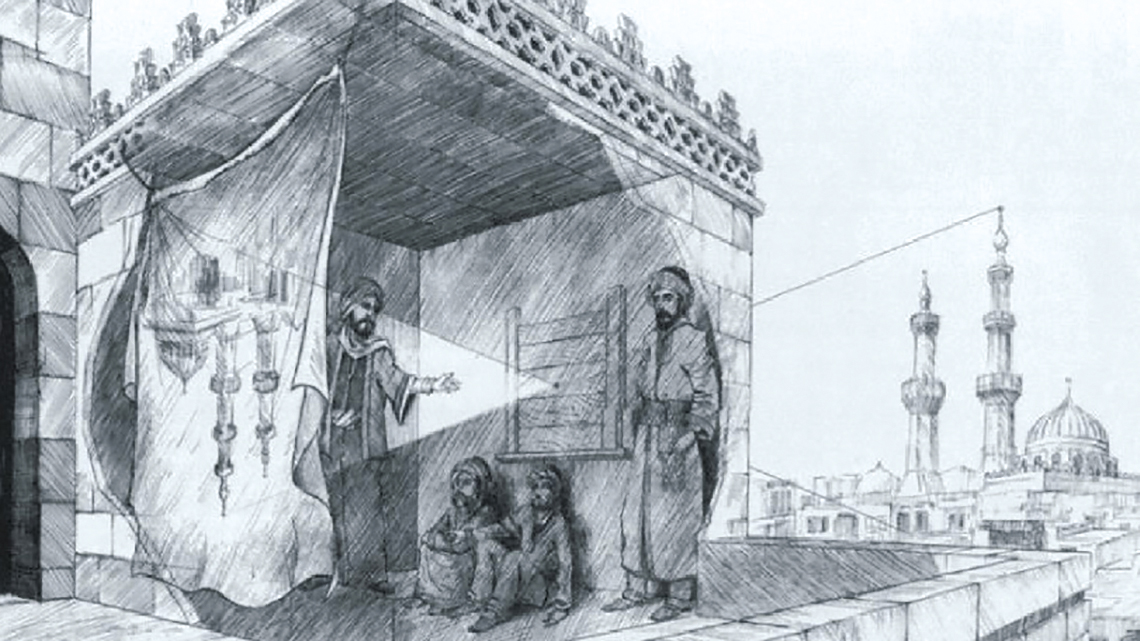
Figure 8 – Inverted image capture, using a pinhole at a dark space, becoming the first “Camera Obscura”
(image source: Khalid 2017).
Besides, Da Vinci made several studies about Human issues during his lifetime, being considered one of the most brilliant minds of European Renaissance. Around 1508, he conducted researches about perception of light, studying how eyes capture the information that travels within light, and its physiognomics (Purtle 2018). Afterwards, Johann Zahn wrote “Oculus Artificialis Teledioptricus” in 1685 (Figure 9), describing multiple optical instruments, including the camera obscura, microscopes, telescopes, peepshows magic lantern, slides, lenses and reflectors (Trust 2011).

Figure 9 – Johann Zahn optic array diagram, one of the optic studies at Oculus Artificialis Teledioptricus
(image source: Trust 2011).
Even though various contributions throughout the ages, only in 1839 appears Morse and Daguerre photographic camera, taking on the shape as we know it now, with the “Daguerreotype Camera” (Smithsonian 2003). At that time, it was finally possible to capture stills, lock up images representing frizzed static moments of the world (Figure 10). Daguerreotypes made accessible a sense of realism and clarity that was not been able before to capture with other depictions of reality like painting.
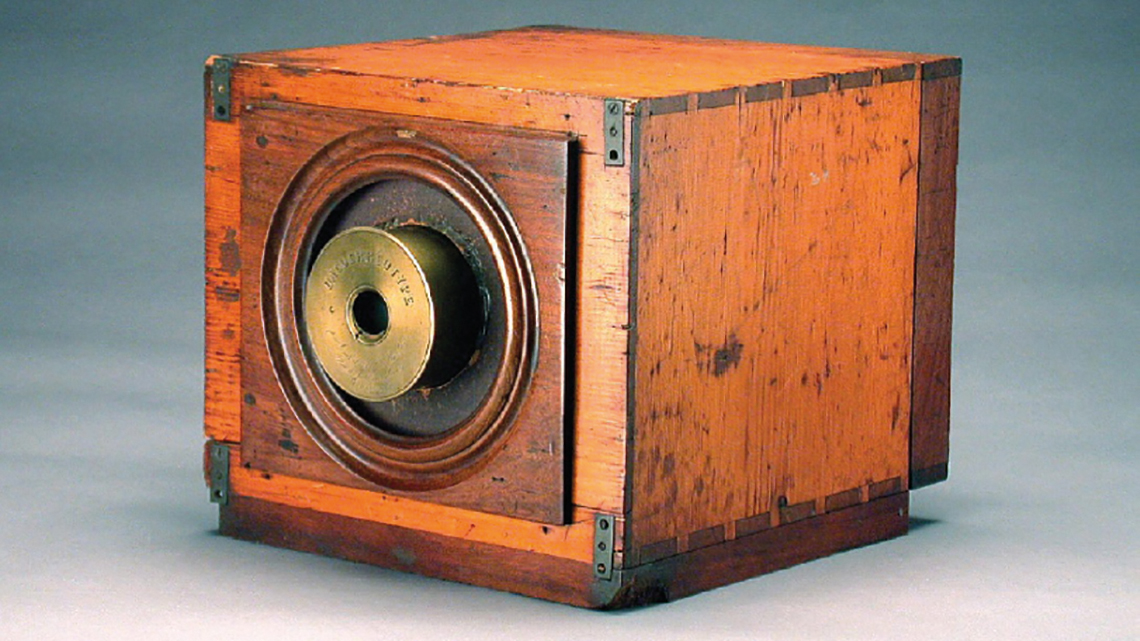
Figure 10 – “Daguerreotype Camera”, first camera by photography pioneer’s Morse and Daguerre
(image source: Smithsonian 2003).
The next step for capturing moving reality was nearby. In 1877 Eadweard Muybridge bought 12 cameras and develops more sensitive emulsion, in 1878, lined up the cameras with a sloping white backdrop placed in oppose position, and across a horse’s path were distributed 12 wires, each connected to a different camera. Finally, 12 shots were managed in less than half a second, and within 20 minutes, Muybridge developed the plates for visitors to admire (Figure 11). Within a year, in 1879, produces the first machine capable to project moving photographic images, the “Zoopraxiscope”, introducing motion to stills, creating the motion pictures. The film in his new machine was a large glass disk about the size of a dinner plate, with figures running around the edge (Afsar 2015).
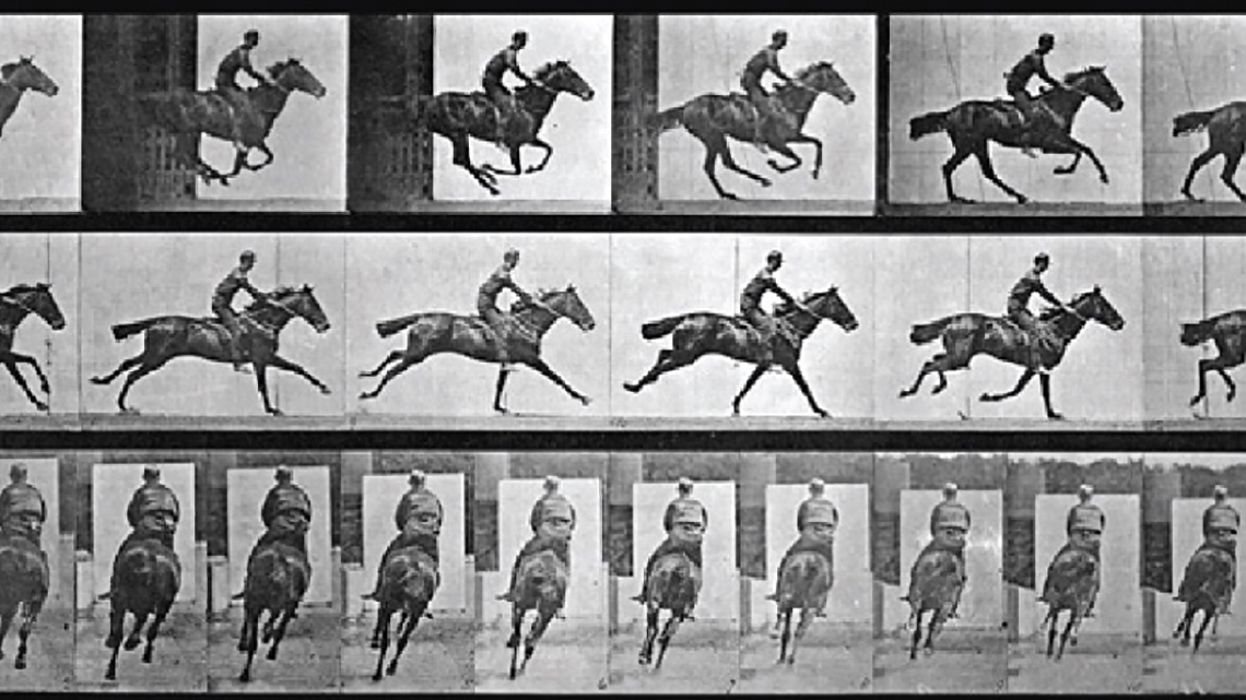
Figure 11 – Eadweard Muybridge conceives an artefact capable of capture and project moving object images
(image source: Afsar 2015).
Soon after, Louis and Auguste Lumiére bring to the world the “Lumiére Cinématographe” (Figure 12), a film camera and projector, actually invented by Léon Bouly in 1892, who lost the patent registration, being then re-registered by the Lumiere brothers on February 13, 1895. About 1896 the first film projector is finally enabling cinematographic production (Google Arts & Culture 2020). They are taken as inventors of the Seventh Art together with Georges Méliès, also French, who is seen as the father of fiction cinema.
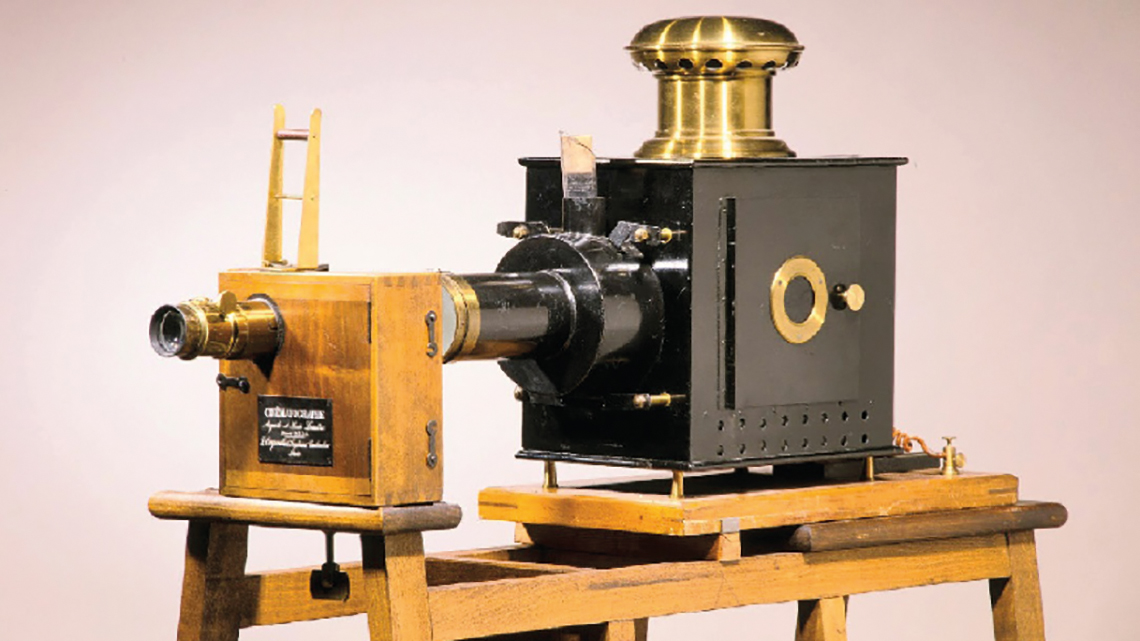
Figure 12 – Lumiére Cinématographe”, camera and projector by Louis and Auguste Lumiére
(image source: Google Arts & Culture 2020).
Rapidly was understood that black and white cannot always reflect how our world is wide gamma colour smeared and constricted the creation aspirations of film producers. Initially, the images started to be dyed one by one. The first method of acquisition and display with colouring appears in 1908 through George Albert Smith’s “Kinemacolor Apparatus”, an process made through alternating red and green filters applied to the shutter in front of the camera or the projector, doubling the frame rate of 16 fps to at least 32 fps. Some issues of time parallax occurred with small differences between the red and green resulting in color fringes that became visible while scenes were in motion (Filmcolors 2020). Subsequently, in Boston, 1915, Herbert Kalmus, Daniel Frost Comstock and William Burton Westcott created the Technicolor Motion Pictures Corporation for producing color cinema (Mannoni 2020). There was a significant increase in the quality of the image colour management with the introduction of the “Technicolor Projector”, used until the 70’s (Figure 13). Although, the problem of three-color recording was only solved in 1932 with the Mitchell corporation, following instructions provided by J. Arthur Ball of Technicolor, expending three 35-mm negative film strips simultaneously.

Figure 13 – “Technicolor Projector” by Comstock & Wescott for color cinema production
(image source: Mannoni 2020).
Moreover, “Kodachrome” film was introduced in 1935, followed by “Agfacolor” in 1936, although “Kodachrome” application for movie, was only released in 1965, and was used to film seemingly everything on the next decade. Kodak was still expanding its Kodachrome line in 1973, and was difficult to believe that it would vanish, however through the 1980´s, camcorders and more easily processed color film from companies as Fuji and Polaroid strongly infringed on Kodachrome’s market share (Suddath 2009). Film pursuit to be the dominant form for cinematography until 2010, when generally was substituted by digital processes of cinematography. In our contemporaneous digital era, there are abundantly ways available to capture, edit, post produce images, with an arm full of tools to materialize the creator’s ideas. At present, we count on Digital Colour Grading to improve the appearance of an image, being conceivable to adjust attributes such as colour, exposure, contrast, black and white levels, saturation and even other detail. Therefore, currently is possible to reliably calibrate an image, adding more content features, to reveal aspects that improve the meanings unfolding of a story.
Building-up emotions on pictures in motion
Emotions awaken at color image projection
Grounded that cinema emerged from the photography movement, Cinema Photography plays an essential role at placing the accurate scenic elements that frame the development of the action and thus allow the story to be narrated. Cinema photography works at communication space, allowing the transmission of character identity aspects and habits, the place and historical context where the film unfolds and specific details about characters environment. This contextualization also is established through sound creation set-up, although relies a lot on the imagetics to transmit the message, on the details that are placed in front of our eyes. The idea that the film could live without image led us to unique moments such as the controversial case of “Snow white” (Monteiro 2000), carefully restricting the image track, maintaining an almost totally black screen in order to focus instead on the personages voices (Young 2000).
Likewise, strong memorable moments can be achieved, removing colors and setting a dark ambience in which a villain makes his apparition coming from the darkness (Figure 14), pulling surprise and chills when suddenly we see his face appear enveloped in a gloomy shady ambience like in “Apocalypse Now” (Coppola 1979), with an atmosphere created for the viewer perceive a certain sorrow.

Figure 14 – Marlon Brando in “Apocalypse Now” in a profound scene from Francis Ford Coppola masterpiece
(image source: Cassel 2014).
Joy, another emotion that cinema often tries to emulate, finds its moments full of light and vivid colours, felt as vibrant flows of heat and passion, like the heart-warming feelings that emerge at “Moonrise Kingdom” (Anderson 2012). We can also find a more nostalgic and romantic approach as on the movie “The Grand Budapest Hotel” (Anderson 2014), where the cinema director pushes the chromatic selection to an intense color-set (Figure 15), although with pastel color gamma traces to endeavour within an emotional nostalgic voyage (Americano 2020). Wes Anderson is always careful at the set composition and color management, featuring a lot of effort in the scene’s creation, entrusting these factors importance.

Figure 15 – Scene with intense colors-set from the Wes Anderson movie “The Grand Budapest Hotel”
(image source: Americano 2020).
Pastel color gamma at chromatic selection possibilities also generating ambiguous mix feelings of happiness and distress (Figure 16). This is explored on the palette used at “Suburbicon” (Coen and Coen 2017), forwarding misleading information to maintain a level of uncertainty throughout the action development (Walsh 2017).

Figure 16 – The use of pastel color gamma generating ambiguous confusing feelings at “Suburbicon” movie
(image source: Walsh 2017).
The use of bright, vivid colors can be used to increase the dramatism of certain situations, at the movie “Volver” (Almodóvar 2006), the bright color-set embodies love, passion, or violence, awakening hate (Figure 17). Was used dark red for tragic scenes and also for some hints of how the plot would unfold (Valdiviezo 2017).

Figure 17 – The use of dark red to emphasize tragic scenes at Pedro Almodóvar movie “Volver”
(image source: Valdiviezo 2017).
As well, we can attribute physical separations between atmospheres, as seen on “Traffic” (Soderbergh 2000), where the images related to the movie development at USA are stained with blue, and the action images at Mexico are stained in yellow (Figure 18). We can signify as a physical narrative separation, or a cold politization in the west, with an opposite heated and disorganized action environment (Troyer 2014). Just a simple scene tinting can introduce new information, and ad several cognitive layers to the movie message insight.

Figure 18 – Different staining colors make the viewer immerge into divergent worlds, producing cleavages
(image source: Troyer 2014).
Meaning construction at image projection
As senses are triggered by projected image unveiling, the process of interaction becomes to take place. The further considerations about meaning construction can be discoursed for cinema, television, painting, sculpture, or any kind of entity with an interface exchange between a matter and an individual, just like at our nearest artistic manifestation closest, the interactive art installations.
Several perceptual stimuli produce cognitive reactions at a visceral level, happening along with human inner self direct manifestation, reflecting predispositions at emotional behaviour (Norman 2005, 38-51). As well, other emotional reactions can occur, being these ones rationally moulded trough social validation associations, making use of the memory to fit up the occurrence that are perceived. These are conformed by the cultural background of the individual, establishing a translation between the message sent by the author and what the receiver realizes from it. Moreover, a message can even uphold a deeper inference: some can reach a sublime signification level, when an image seen or matter experienced take the individual to an existential closure (Csikszentmihalyi and Rochberg-Halton 1999, 3-49). The emotional elicitation, produced by certain images, provokes, as well, reactions at the physiological level (Giannoulis and Verbeek 2014, 4-8). If a movie touches you, then tears are realised, of joy or regret; when you get the joke, you laugh; as darkness suddenly unveils a monster, your heart suddenly bursts heavily jumping… These physiological responses also contribute to the psychological set up of our brains, in a reverberant consequence. The realise of endorphins generated at hypophysis gland, impress effects on brain areas responsible for moderating pain, mood, depression, anxiety, as well on the sympathetic nervous system (Zigmond et al. 1999, 1246-1252). This is realised at installations as in “Pixel Wave” (Chevalier 2015) where a synesthetic counterbalance of inputs, between vision and spatial perception, create Trompe-l’oeil effects, interferences generated by projections in the perception of visitors, creating a kinetic sensation of moving floor (Figure 19), as in Kinetic-Art and Op-Art experiences on movement, light, optical illusion and prefigured digital art. Miguel Chevalier installations integrate generative and interactive methodologies to explore the limits between nature and technology (Vernetti 2015). At this type of art manifestation, the circulation through the exhibition provides changes on how matter is perceived, influencing the consciousness of the spectator, because the visualization depends on the view from composition distribution is perceived (Bastos 2006, 272-279).
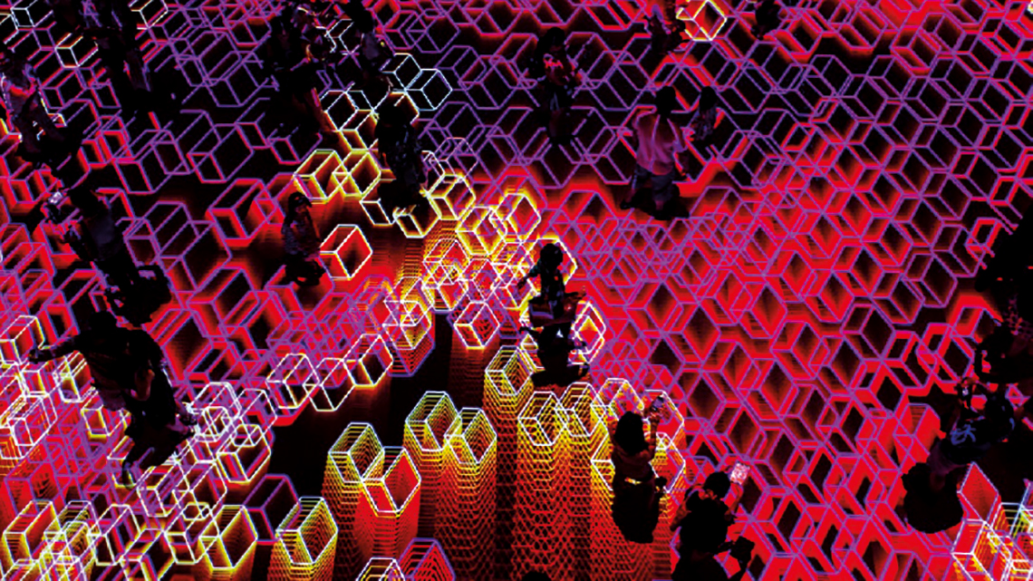
Figure 19 – “Pixel Wave” interactive installation of Miguel Chevalier, a counterbalance of synesthetic inputs
(image source: Vernetti 2015).
Visual arts communication value
Considering the importance of the media through which messages are transmitted, we must emphasise the communication value of visual arts. In this particular instance, reinforce the importance of film content creation and image projection as indispensable entities of the human intangible heritage, being communication providers at transmission of information, knowledge generation, vehicle of technological advance, culture of civilizations, artistic creation, philosophy, well-fare and comfort, and much more. Is a requirement to provide the proper appreciation and respect for things as well, from the importance they have in our lives… as we already should have been doing in relation to what it is to exist, as individual or as a collective in this world, in addition as with the relationships between humans and the other organic and inorganic entities forms with which we share this, most of the times, beautiful planet.
Inherently and by excellence, the communicational artistic specific space is the vehicle through which ideas, thoughts, manifestations, phenomena, understandings, information, interests, narratives, history, dreams... are transmitted. At communication process, the conveyed messages lack support, they need a substrate where they can be spread. The things with which we surround ourselves, some created by the human, are full of layers of information. We can perceive characteristics that reveal raw materials provenance, how and where they were produced, by whom and for what purpose, also revealing to us the underlying history of the culture that produced it (Figure 20). Nowadays, in the globalized information society in which we live, characteristics like these are more diffuse and trickier to obtain.
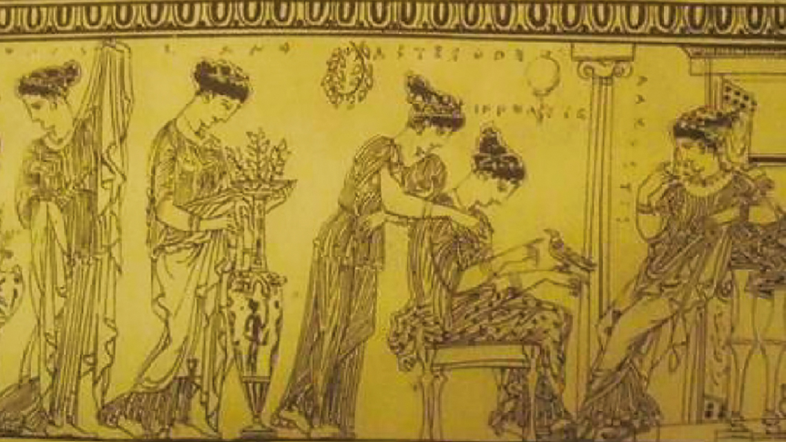
Figure 20 – Cultural civilization characteristics can be observable at images painted on Greek vessels
(image source: Nicole 1926).
The means by which contemporary communication contents move have dematerialized themselves, launching in the ethereal lines of code and graphic stains, that belong to a new intangible heritage, but that reveal too often belong to this world without borders, with a clear tendency to uniformity and the propagation of similar ideas across the globe. We know that a supposed universal equality of access to same contents may be beneficial in a way, but sometimes the endemic and cultural specifics of some ethnicities are left out, their condition is been characterized as representative of locations that do not yet had a similar evolution to what is sometimes called the westernized world. The space of dematerialised communication proves to be a volatile and particularly conducive of being fugacious. However, it is something that has made us create bridges with information networks, providing global access to zettabytes of ideas, documents, photos, videos... accessible with a single click! The mediation of the communication space has a special importance in what can be understood as the transmission of ideas, concepts, information that benefit the human being in daily existence. In this way it is possible to choose the images, contents or narratives to be transmitted in order to provide an improvement in well-being and quality of life. A precise modelling of information, whether in sound, images or other sensory stimuli, introduce interesting perceptual experiences that produce a connection between individuals... similar to the stories told around a bonfire: narrated events or teachings based on the cultural heritage of that people where told while the individual who listened attentively felt the presence of the collective, the warmth of the fire on the skin, and the security of being protected from predatory threats. Alike at the cinema, or installation, or even other collective phenomena. Is recognized that there are too many historic cases where communication served bad intentions, used for warfare with disastrous effects. Although, as a message can be perniciously organised, there are often cases too where the message has been properly worked out leading to considerable cultural and societal advances. In painting and sculpture, ancient forms of art, there are uncountable representations that summon what the author wished to manifest, leaving to the observer to interpret it with the tools of decoding that his cultural background provides him.
Of course, minds are composed of more than just direct images of objects or events and their translations into language. In the minds there are also many other images, relative to any object or event, capable of writing the properties and constituent relationships. (Damásio 2017, 132)
Is pertinent and coherent to produce content adjusted to provide moments of delight and beauty, loaded with historical legacies of the cultural matrix that characterize people of a territory. It is a matter of paying homage to invisible natures of the material world. Giving voice to images that characterize the individual’s ecosystem, his surroundings, to reveal the links the individual has with a community and with the place he exists. At “Gallerie di Piedicastello” (Trentino 2007) two abandoned tunnels were fitted with extraordinary environments, hosting expositions about the history of Trento city (Figure 21). This is a step forward, allowing new perspectives to be drawn, on possibilities linked to the past, but also with an eye on the future, and… new angles that emerge.
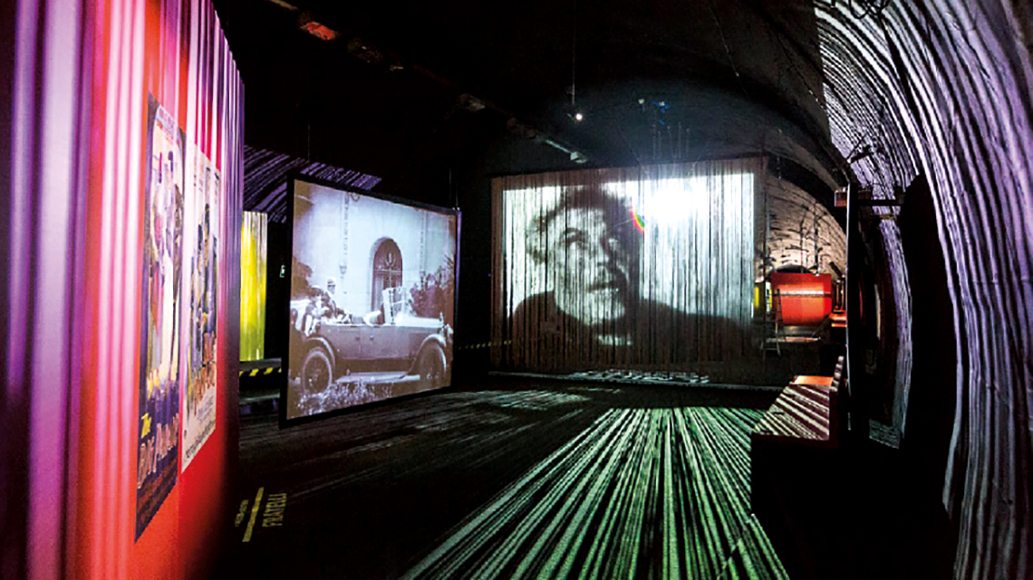
Figure 21 – The old tunnels host an extraordinary environment, tribute projections to Trento memory
(image source: Trentino 2007).
Modulation of communication space
The link between the mechanisms of perception, the way we feel an experience, and the mixture between the various sensory receptors are extremely important. These inputs are vital in the cognitive formation, but they reveal to be conformed by brain processes. A plain image of birds migrating in a V shape formation, with the sun in the background can evoke memories of a near past in which everything was simpler, when natural life flourished, provoking emotions of satisfaction, cognitive associations that generate a feeling of belonging with a natural territory, of connection with the Earth, producing meanings of a welfare enhancing nature (Figure 22). Still they are flying off toward an unknown future place. Then, how can we improve an increase of enjoyment on images to be projected? The assertion that we can produce contents that can up lift is revealed in history to be right. Furthermore, the well-being pursuit is not solely linked to the amount of healthcare managed to a population. The relations established between people and the place fruition can as well generate increased affinities, facilitating a positive effect on enjoyment.

Figure 22 – Flying birds, image projection on a strappy background rosy colour tinged as a sun to be set
(image source: Minty 2014).
Additionally, is important to understand how to, derived from specific essentials’ inclusion, transform the way we look at reality, how cognitive meaning acknowledgment can be influenced by the modulation of perception, at communication space mediation. Information attained and to be addressed, is all around in our environment, and is processed into knowledge, through mechanisms of perception, awareness, relationship, imagination, judgment, interpretation, and memory. The within intrinsic value is a result of several layers provided at meaning cognitive attribution. Is essential to realise the provenance of significance, and value, from the person towards an experience, to produce contents with deep beauty on behalf of arising new proximity relations between people, and with the place they usufruct the experience. Emotions occur when sensing a perceived involvement, originating messages which the interacting individual unfold, in a quest of understanding of what is to be, discovering new attributes for what occurs.
Individual surroundings
The meaning attribution, by organizing the information acquired through our perceptive senses, always starts at existing in a determined place and time. Oddly, sometimes the individual does not even decide to attribute a particular connotation to an experience that occurs. Still, the interaction circumstance involves being present at the event, and experience what is happening. The direction of attention driven by an intention grounds that the individual surrounds himself with the world he lives (Heidegger 1927, 463). The subject of interaction exists, one way or another, in the same place and time as the matter in contact, even when the dematerialized essence of certain media takes to new understandings for what is to be present. At Westonbirt Arboretum park (Figure 23) visitors can experiment the contact with the beautiful natural surroundings, spectacularly enhanced by twinkling illuminations (Singleton 2018).
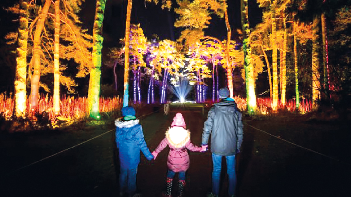
Figure 23 – Westonbirt Arboretum transformed into an illuminated surrounding for people enjoyment
(image source: Singleton 2018).
The relationships of the body with the world depend of an inherent body consciousness, mutable, specifically proper for each one of us, as the body, in relation to the world, is not only a thing, but a permanent component of a interaction experience (Merleau-Pointy 1945, 68). Meaning construction is possible because we exist, since we manifest our presence at this time at Earth, perceiving relationships within the ecosystem that we manage to live in. This initial layer of being is our body obtaining information from the environment, however, the quantity and value of stimulus acquired are going to influence how the individual senses and experiment. Our senses pick up a variety of stimulus in different ways and from diverse provenience, particularly from the environment (Gibson 1986, 59). Perceiving what occurs around us takes a great part in the interpretations of what is a reality, making it difficult the establishment of stiff parameters to a stimulus correspondence toward a specific signification. It would be particularly difficult to all persons uniformly perceive an experience. The body itself has a fundamental roll to the interaction process, as multiple sensors wrap our bodies and transmit inputs of information to our brain. Senses are usually attained as being touch, taste, smell, hearing and sight, yet, is considered existing other senses that contribute to the surroundings recognition, as proprioception or balance (Burnett 2016, 141). These evolutionary aptitudes are deeply connected to memories inside our brains, easily prompting reactions to past occurrences. Perception captures indicators and information that can be used on cognitive construct (Figure 24). Certain frequencies of sound can induce states of mind, bringing memories engraved on the brain. Similarly, some images attract more. Geometric proportions also carry descriptions of the environment that our brain unveils as beautiful.

Figure 24 – Our body as multiple ways to sense and to transmit information to our brain
(image source: thisismein360vr 2018).
Cultural backgrounds
Frequently meaning is uncovered due to the uses of a matter, showing paths that reveal human transactions, motivated by a heritage legacy, in levels such artistic, social, ethnic or even intellectual. From the cultural perspective, the production of something is a cognitive and widening process in which artefacts must be produced materially as things, but also culturally, as being a certain type of thing (Figure 25). Distinctive attributes for understanding cultural backgrounds are: ethnoscapes, ideoscapes, mediascapes, technoscapes and also financescapes (Appadurai 1990, 589-591). Ethnoscapes are about the people who make the transactions between places. Ideoscapes are an account of the religious and ideological legacies that assist and constrain meaning attribution. Mediascapes is how information is transmitted from a particular group of people and memories that induce meanings about why a given matter exists. Technoscapes are related to the technology employed, evidenced in the materials used, tools, technological processes and relation with final users. Financescapes are about the variability of resources for what can be materialized in a location. Small variations in details can make the difference, since the incorporation of a feature that one cultural group love, other might hate.

Figure 25 – Captation of a person with strong identity traces, at the first Aboriginal light festival in Parrtjima
(image source: Horan 2017).
Moreover, is attained six cultural dimensions that affect how we think: power distance, uncertainty avoidance, individualism vs collectivism, masculinity vs femininity, long vs short term and indulgence vs restraint (Hofstede 2011, 10-15). Power distance is concerned for the ways less-dominant members accept unbalanced sharing. Uncertainty avoidance indicates the embarrassment with risks. Individualism vs collectivism measures the call concern for people. Masculinity vs femininity refers to aggressiveness in opposition to relationships value, shows how sensitivity is dealt and concern for the others well-being. Long vs short term orientation refers to the extent that a society maintains or adapts its traditions. Indulgence vs restraint relates gratification in opposition to control of basic human desires. The culture of a group influences the individual behaviour packed of memories, backgrounds that refine attention to specific details, moulding the of meaning creation possibilities.
A conception, explicit or implicit, distinctive of an individual or characteristic of a group, of the desirable which influences the selection from available modes, means and ends of action. (Kluckhohn 1962, 395)
So, behaviour is a combination of individual capacities, influenced by patterns learned with others, leading to certain reactions at interactions. Alongside, habits are lifetime acquired, inducing distinguishable patterns at choice. Therefore, behaviour also moulds culture.
Meaning and meaningfulness
Emotions occur when sensing a perceived experience, originating messages for the interacting individual. A matter must be useful or have extreme beauty to engage the need to be retained, but the true beauty of a thing has to be with more than that. The attractiveness is presented divided into three general areas: visceral, behavioural and reflective (Norman 2005, 38-51). Visceral has to do with the appearance and with the direct connection with nature, is a direct predisposition that is transversal to all, differing by taste. Behavioural reflects essentially the usability, as the performance and environment determine if it will deliver capabilities that satisfies its user. Reflective, reveals us how important the message of the object is, creating a concept, with the message and culture as the preponderant role. Certain matters are worked for a specific use, planned with parameters that fulfil the needs of a societal group.
The installation “Daydream” (Nonotak Studio 2013) is a production with an invitation to contemplation, aimed at establishing a physical connection between the virtual space and the real space (Figure 26). The usufruct appeal for this conceptual creation, drives towards visceral or reflective interaction levels, as it delivers remoteness from the practical usability levels.

Figure 26 – Audio-visual installation generates space accelerations, distortion and metamorphosis
(image source: Nonotak Studio 2013).
The substance of cognition comprehends the processes that form the basis of behaviour. Cognitive structures are enhanced by perceptive stimulus, evoking feelings, memories, and signifying. There are several symbolic representations that human place in and multiple interpretations they make about. Meanings attributed vary with time, space, and circumstance. As a result, new forms appear based on the visual, functional or matter properties. Three main levels of representation are considered: personal, social and cosmic levels (Csikszentmihalyi and Rochberg-Halton 1999, 3-49). The personal level mirrors the inner self emotions, a reflection of feelings, of personal aspirations, of what individually extracts about a subject. This attribution of meaning can be entirely intuitive, as can be, behavioural and reflective (Norman 2005), with a rationalization that allows a built, denser message. The social level of representation holds expectable interaction patterns based on the shared implemented cultural structures of attention. Individual expression has a very strong social dimension: an object can mean something to a person through the context in which it is inserted, so…, the personal representation, which mirrors individual based emotions, is also a reflection of social dynamics. This framework allows the human being to feel that he is part of a larger, or more restricted group, but integrated with other individuals. Lastly, and of great importance, the cosmic level of representation, achieved when the meaning transcends the matter, and the significant becomes meaningful. A scarcer kind of interactions can uphold the surge of such feeling, however some objects, movies, installations, and other matters of kind, can arise sentiments of fullness and completion.
In traditional societies this cosmic level includes the great natural phenomena that control the rhythm of life: the sun, the moon, the stars; water and fire; wind and earth. Every society has to make believable connection between his own purpose and those that make the world go round.
(Csikszentmihalyi and Rochberg-Halton 1999, 38)
For new art forms, is essential to centre our attention on achieving meaningful innovative proposes, reflective of the individual and collective needs, and switch-on a bright connection to the world. Desired concepts reveal personal identity messages to others. The expression of pure joy on these kids face, as they usufruct together the immersive projections at “Parrtjima - A Festival in Light” (Horan 2017), is the embodiment of whom has reached out and touched space, achieving a sublimely meaning strata for all they are experiencing... This enjoyment impact (Figure 27), emerges from a mixture of novelty, enlarged-scale interactive elements, digital audio-visual artworks projection, stories told by regional artists, cultural heritage assimilated creations, or even from the Parrtjima lampshades suspended beneath the stars to shine as a bright cosmic level of representation.
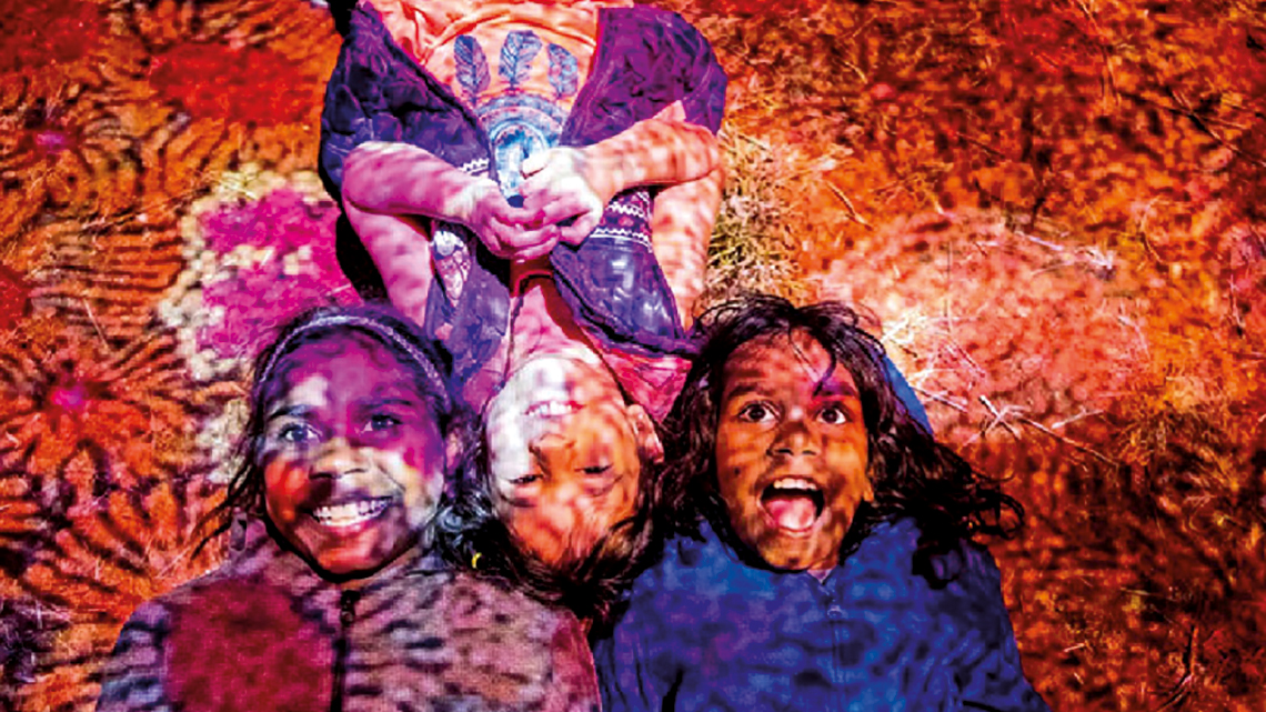
Figure 27 – Parrtjima - A Festival in Light, shine the light flown from enjoyment of these kids’ happy faces
(image source: Horan 2017).
Image composition: static and motion
Throughout the ages many tendencies of art forms were dwell. The surge for cultural assessments is multiverse, implying that there is oodles of expression ways. With countless movements with their own technics, and own interpretation of how to manifest expression, is hard to enunciate what are the proper methods to materialize certain contents. Nevertheless, due to our bodies mostly are equipped with identical bio-sensors, is assumed that human’s perception mechanisms generally are similar, presupposition that intentionally excludes constraints by processes of meaning construct related to behaviour moulded by cultural background. It must be referred, that even in an inclusive paradigm, some individuals have particular restrictions, and may possibly set them in a different surroundings perceptive position.
Then so, perceptual bio-geometry of human sensing mechanisms was developed through ages on given specific reactions to particular stimulus. Focusing on image content creation, we pursuit the generation of positive emotions in reaction to certain combination and juxtaposition of image elements. For the proposed outcome, based on documental research, the further enunciations compile procedures considered relevant. This is a short compilation on shooting tactics for static scenes (Langford 1993, 62-67; Langford 1996, 32-56), as well of techniques for cinematic motion composition (Lewis 1996, 38-48), both consistently integrated and applied at Cinema Photography production. Several of these essential components used on cinema creation are applicable at interactive art installations content production. However, all the further indications can be completely neglected in favour to art creation freedom, and understated that shifting against these guidelines can sometimes even enhance the plot unveiling…
Careful composition: can be applied both to cinema and photography set up. Balance the various elements available. On movie contemplate each image in relation to the next applying visual variety as much as possible.
Shape: the main process of identifying an object is to perceive its form. Capturing the silhouette, eliminating irrelevant elements, helps to clarify the communication.
Natural pattern: highlight natural details by framing closely patterns that can be found in nature, a close-up of a small pattern part often causes a greater impact.
Textures: make use of textures to express the surface characteristics of an object, employing a soft directed light is ideal for highlighting textures, such dawn or dusk.
Use of shadows: can be natural, or created artificially, their near viewpoint will exclude distractive details.
Symmetry: find form regularity of subjects, the harmony of symmetrical look naturally pleases the eye. Original point of view, that carefully captures these features, help produce a captivating visual (Figure 28).

Figure 28 – Jacob and Wilhelm Grimm Centre, symmetric framed shot exploring the building grid lines
(image source: Stewart 2016).
Sense of space: filming two people in dialogue, always include a long general plan to define spatial relationship. Maintain this sense of spatial relationship when you are recording close-ups of people, or it will confuse viewers.
People composition: do not leave too much space over their heads, as creates an unpleasant, unbalanced composition, too much upper space creates disturb.
Create space for eyes: frame static images of people to have more space in the direction they are looking than behind. The result will be more enjoyable and logical for the viewer, reinforcing the direction of the theme’s gaze.
Rule of thirds: it´s not a requirement to place the main theme at the centre of the framework. Imagine the frame divided by two horizontal lines and two vertical lines. The four points where the lines intersect are the best areas to place the most important elements (Figure 29).
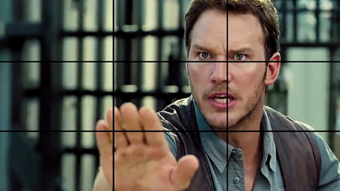
Figure 29 – The lines on the 3×3 grid are the places where our eyes automatically look for information.
(image source: Janney 2017).
Prevent stacking up: remove irrelevant objects or frame it from another angle, making sure no objects appear in background that seem connected to theme.
Use of frames: although restricted to the horizontal and fixed format of a movie screen, you can create visual variations using foregrounds. Framing can reinforce the importance of the theme, in a door, window, bridge arch. Framing behind the theme can produce a subtle effect.
Use of lines: spaces have vertical, horizontal, straight or curved lines. The use of these lines can influence the composition and the movie environment. Scenes that contain vertical and horizontal lines help give a sense of order and stability. Horizontal lines, at landscapes, give a sense of calm, tranquillity and space. Vertical lines induce a sense of height and greatness. Lines with tight and irregular angles produce a dramatic effect. Curved lines induce a pleasant feeling of movement (Figure 30).

Figure 30 – Composition using radial leading lines making a pleasant movement sense of the subject
(image source: Format Team 2019).
Depth of field: the focus of a theme can alter its perception, so, the focal distance the distance between the nearest and farthest objects in focus to the subject will change awareness of the theme. Aperture, usually dictated by the intensity of light, have an influence on the depth of field, a small aperture creates a greater depth of field, with both subjects acceptably focused. A large aperture creates relatively small depth of field. The background theme becomes blurred, which can create interesting effects.
Viewpoint change: this generate interesting variations by composing images from different angles. Compose images from low angles and vary with images composed from high angles. The unusual viewing points and foregrounds help create a depth view.
Breaking the rhythm: an appearance that is too rigid will become less monotonous in which the visual rhythm is enhanced and relieved by an irregular intrusion during the action sequence.
Do not fragment the subject: avoid framing that cuts people off at the joints, do not run the risk of creating a headless or footless effect. In general planes, always leave some upper space or the figure will seem crushed.
Continuity: filming consecutive images with sense of direction, doing it on the same side of an imaginary “line of action” to maintain a sense of continuity at screen direction. Staying on just one side of this line connects images of different places. Overcoming it, confuses the spectators, thinking the theme has changed direction.
Changing direction: gets over the problem of inversion of movement, avoiding that the theme seems to move inversely. Filming neutral images at the “line of action”, in which the subject moves directly towards or away from the camera, act as bridges between images from opposite sides, masked with frames of the main theme.
Framing at movement: images of moving subjects need more room in front than behind, otherwise they appear to be pushing the edge. Start following the subject as enters the frame and follow it at constant speed, describing an arc. For a good scene finalization stop the camera and let the subject leave the frame
Fill the frame: filling the background with too many irrelevant details is a common mistake, to draw attention fill the frame with the theme of interest (Figure 31). Capturing a moving object in our scene, however small, can divert the viewer’s attention from the theme.
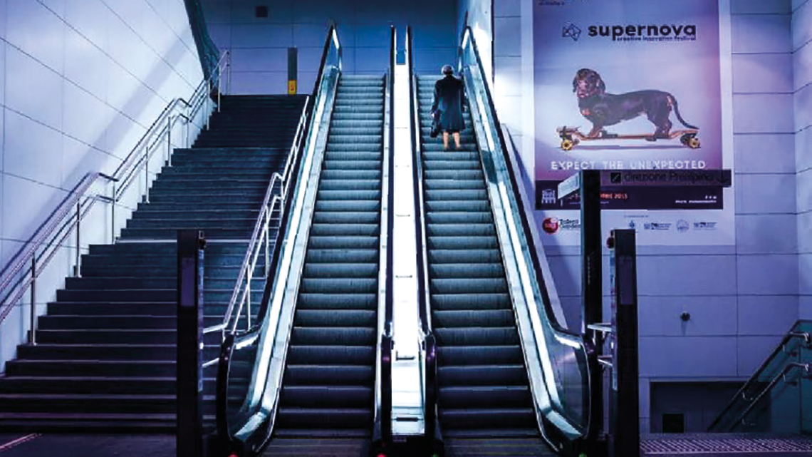
Figure 31 – Filling the frame is a way to draw attention to something that people would usually miss
(image source: Format Team 2019).
Line of sight: when two successive images of two people talking, show them looking in different directions and take both images on the same side of an imaginary line that accompanies the axis of looks. If you cross that line you will give the feeling that they ignore each other.
Equilibrium of opposing angles: opposite angles must balance each other. When two subjects are in the same image is possible to maintain a spatial relationship feeling by keeping the camera on same side of gaze.
Complementary angles: spatial relationship sensation is reinforced between themes as a low vision point of a person looking at the floor can be balanced by another image with a high vision point.
Golden spiral: the Fibonacci sequence uses a chain of squares, golden ratio rooted (Figure 32). This allows a composition method that perfectly performs while it uses a natural flow in the image, guiding the viewer’s eye.

Figure 32 – A more advanced composition level, directing viewer’s eye right where it needs to go
(image source: Swalls 2016).
Sense of time: the suitable duration of each image is vital. Static images: the length is set by the amount of information the audience needs to capture, min: 3 sec. by image; Scene composition: for new themes allow 7 sec.; Overall plan: about 5 sec.; Medium plan: shorter time, viewers will be frustrated if is too long; Close-up: about 4 sec. If you cut too early, viewers will be upset.
Continuous action: images involving cycles of motion should be kept for as long as necessary (Figure 33), for the cycle to repeat itself. Cut at the end of the cycle. Still images with continuous activity or slow-moving objects should be kept longer than those of stationary objects.
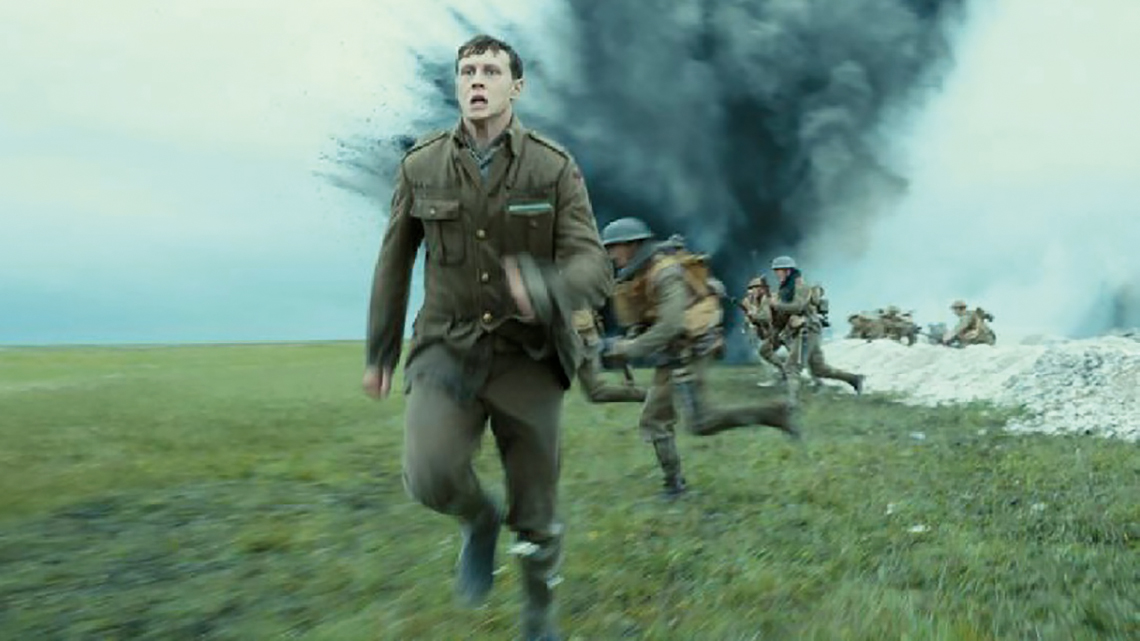
Figure 33 – The continuous action at “1917” was taken to an extreme level, filming it as one big action shot
(image source: Jones 2020).
Manipulation of reality: your subject looks at outside of the screen, viewers expect the next image to reveal what is seen. This can explore an interaction illusion between unrelated themes, filmed in different places.
Cut scene: realizing the right moment in time to cut the footage is a matter of common sense in order to know the extent to which a subject maintains the interest level. The worst cut is the one that leaves action incomplete.
Colour Grading: hue, balance and light
From the beginning of times it was realized that colour is essential, such as in nature, as well for the creation of certain environments. There are several psychological reactions, described to occur, when the perceptive human sense of vision is being stimulated by different wavelengths of the visible light. The use of distinct groups of colours in image composition allow the introduction of distinct emotional environments. This is an aspect of great importance, as when colours are perceived, the individual attribute meanings to them, finding association with certain colours group or colours sets (Heller 2018, 19). For movie concept, as well at photography production, and furthermore, for image content creation to be displayed at our interactive artistic installations, is a key factor to adjust hue pallets, colour and light balance to produce the intended atmospheres that improve the storytelling in enjoyable ways. The right image compositions along with the appropriate colour grading will establish the ambience for the catalysation of the message, and set the environment required.
Hue pallets: there are groups of colours associated with particular mindsets, contemporaneously used in movie production to enhance the communication process and make available certain traces of emotional information. This colour sets selections can be applied through dressing, decorating, scenarios and props. Is possible to choose filters to even chlorate the whole scene if it is intended. Likewise, hue pallets can be employed on cinema post-production using digital color-grading. Some examples for colour combinations (Figure 34) are visual expressions of colour pallets and consequent conceptual relation to emotions (Heller 2018, 48-49). Here are just some examples of colour combinations pallets that can introduce particular emotional states.

Figure 34 – Examples of colours groups, their implementation is associated with established mindsets
(image source: Castro 2020).
Colour balance: forms gain continuity through an open use of colour at image composition. It can be explored like other visual structure type. Colour combination is valued as approach saturation tones in alternative to frame structure (Langford 1993, 74-91). Through careful selection, a single colour be of great impact, varying saturation in counterbalance to the rest of the image.
Colour contrast: different contrasting hue strokes can together create a very distinct image if done with saturated colours of opposite sides of chromatic circle. Warm saturated colours and cold saturated colours cause higher contrasts, with a stronger effect when a colour is complementary, positioned on the opposite side of the circle, triggering dramatic effects, that emphasize the main subject. Using adjacent tones, next to each other on the chromatic circle, will also achieve an excellent effect, helping to generate a smoother and more harmonized composition (Figure 35).
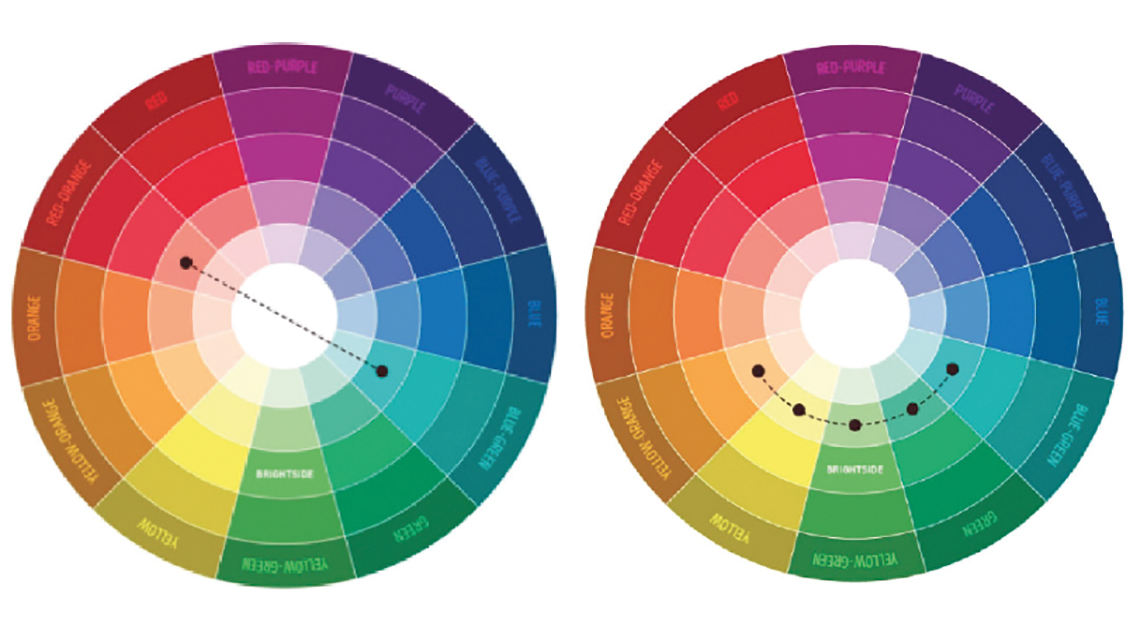
Figure 35 – Chromatic circles with complementary tones on the left and adjacent colours on the right
(image source: Dias 2019).
Colour attraction: a dramatic contrast can provide insight into the main theme with a very small colour increase. In a landscape scene, the main theme despite of occupying a small area, can be valued increasing his tone intensity, to be perceived as the centre of interest.
Colour as support: the addition of soft colours for a background helps connect the main elements an image, because it balances the main foreground feature with gravy tones of blacks. This effect is dropped out in a black & white composition, as it requires more contrast.
Games of colour: high tonalities can supress low and neutral tones. Colour lit up areas hold information that manifests differentiation contrasting to the background.
Soft opposing colours: a composition can work even when limited to mellow contrasting colours, producing different soft tones that can still differentiate elements.
Dramatic colours: opposite strong colours add drama, creating sharply contrasts, a different colour gain a new strength to the main subject, building its own impact.
Warm and cold colours: If strong colours are well balanced, by more neutral shades, is possible to meet a dynamic colour highlighting, by using warm colours against shallower cold ones to focus on the subject (Figure 36). A brightly coloured mass can even surpass a more consensual efficiency of a restricted tone range.

Figure 36 – Dynamic warm colours set, highlighting strong and vibrant tones full of energy and life
(image source: Ferreira 2019).
Emphasis of colours: controlling the emphases point, does not mean that composition has to be exceptionally colourful. The tones of a scene can be limited to a soft colour gain, adding strength to the main subject through an isolated colour spot, to help uncover dramatic unfold.
Colour break: when a small object appears in a scene can have a disproportionate influence in relation to its size. Therefore, a way to focus is to stain the main theme with specific colour to edge the properties of the subject. (Figure 37). Eyes will be attracted by the colour assortment that a distinct tone provide in these cases.

Figure 37 – In this immensity of water, the existence of a small boat is revelled by the bright yellow use
(image source: Neubert 2018).
Black & White contrast: the subject becomes more visible by contrast with the use of a black foreground on an exposed and brighter background, where justified dark becomes a powerful form outlining silhouettes.
Black & White isolation: for this kind of image, a white a small area as subject, surrounded by shadier blackish tones, can drive attention to the main theme.
Light balance: proper use of light is a crucial aspect of cinematic and image creation. Illumination affects how to get the most out of the subject. To understand light, natural or artificial, is essential to realize that the eyes perceive distinct shapes as distinct illumination at stack (Langford 1993, 92-107). Light has some psychological meaning peculiars, as unfamiliar lights produce a certain restlessness, or attract our attention as candle at dusk. Control illumination detail by establishing proper lighting conditions, or by twitching devices capture parameters such: aperture; shutter speed; exposure; iso (Figure 38).
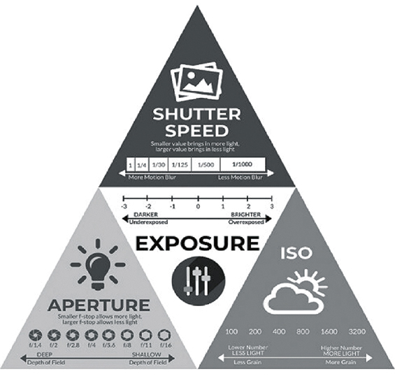
Figure 38 – Capture creative control: aperture, shutter speed and iso are essential to get a perfect exposure
(image source: Grey 2020).
Front light: when the source of illumination is directly behind the cameramen, shadows fall behind the theme. Is a hidden lighting type, the surfaces enlightened reveal maximum subject details but minimize textures, colours are brighter, good to glass or mirrored brilliance objects.
Strong lighting: originated from a compact light source, flashes and bare lamps, with an intensity comparable to sun. Placed behind objects turns hidden by shadows.
Soft lighting: type of illumination such as light scatters passing through clouds or reflecting on a bright surface, the result creates light shadows of unclear contours.
Shallow lighting: strong surface illumination, highlights textures surfaces. Yet, an accentuated plane, strongly illumination, demands a reference point inclusion.
Contour lighting: outline lighting is the medium that allows to film dark objects against a dark background. Usually the outlines emerge when light source is beyond the subject and laterally forming in a dark background.
Lateral lighting: side illumination provides deepness to three-dimensional themes (Figure 39). However, might deliver fewer information, due to the strong contrast between non-illuminated and illuminated areas.
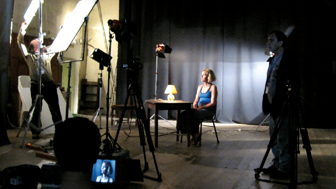
Figure 39 – Production stage, with lateral illumination being set for close-up shot of the theme subject
(image source: Castro 2012).
Sun and reflections: pointing a camera directly to a bright sea, possibilities capturing the splash reflection of sun light. Also, can introduce coloured flares of different shades and sizes, that may be used as a constructive element. Get clear intense flares, by shading the lenses, through glass without anti-reflective layer, or an old lens.
Lighting effects: light and shadow goes together along the way. In essence, shadow is an absence of light. The relation to what surrounds it can be so important as light itself. Shadows appear linked to objects in two main ways: contained or projected.
Contained shadow: remain within the limits in the form of the object. Still, the projected and contained usually occur simultaneously around an object.
Projected shadow: fall on a surface far from the object itself, being even possible to exclude an object forming the projected shadow (Figure 40). Under a strong side light, long shadows are generated, turning difficult to distinguish objects, the greater their quantity and shape.
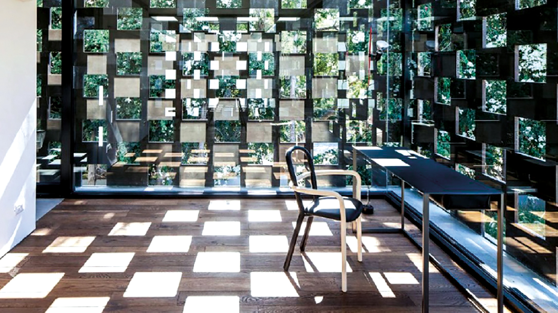
Figure 40 – Projected shadows, transforms this room in an endless squared space, vanishing its limits
(image source: Mehta 2017).
Light curtain: a curtain of light rays traveling through a dusty atmosphere, can generate physical separations and special ambiences behind bars pattern (Figure 41).
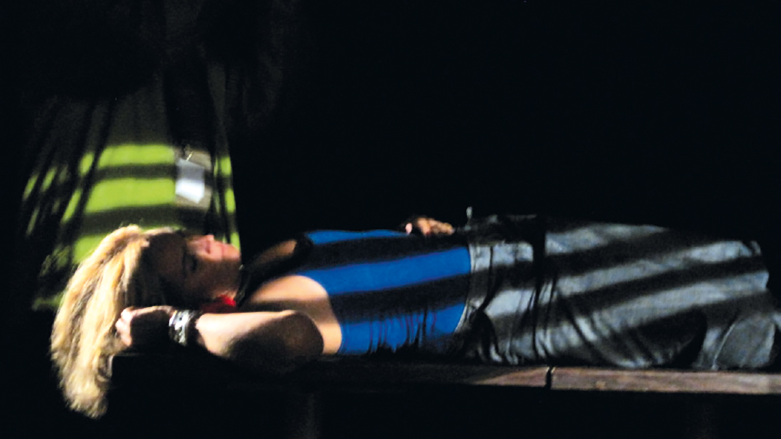
Figure 41 – Ambience produced by introduction of light bars pattern, as sun shining across a ribbon curtain
(image source: Castro 2012).
Shifting shadows: shadow lines falling over a column can cause image distortion, following the object shapes by direction change, even shape out the subject theme.
Low contrast: landscapes are generally considered colourful but capturing them in low-contrast conditions could warn colours, useful as long as used with care.
Against the light: an opaque object caught in light path seems to shine against a lighter background (Figure 42).

Figure 42 – Human silhouette capture, with great beauty as it seems resembling a beacon irradiating light
(image source: Lehtinen 2007).
Silhouettes: the use of sharp and well-defined contours retain a desirable simplicity. The theme communicates itself to the viewer only through the shape.
Exposure on silhouettes: when a foreground theme is poorly lit in relation to background, the right exposure to the background can achieve a strong theme silhouette.
Environment and silhouettes: the details of a certain background contribute for environment feeling, when the image is taken directly against the light, hiding from behind the figure and adding a slight dispersion of light.
Low-key lighting: dark and mysterious atmospheres are created by poorly lit exposition background, good for portrait, setting dark shades and flesh tones. Emphasise face and hands, shapes are transmitted with character.
High-key lightning: provides subtlety and delicacy to portrait, due to lighter values use of tonal scale. Uses pale tones of the highest tonal range to create a sense of space (Figure 43) generating peacefulness feelings.

Figure 43 – Pictures with greater quantity of dim and bright tonalities are viewed as positive and attractive
(image source: Frost 2019).
Skin texture: a human face expression carries a huge amount of lifetime evidences. In order to capture this interesting strong character, place the human subject in the shade so that the soft light emphasizes him.
Polished surfaces: any material with a smooth surface reflects light in one direction. This means that a direct light or a large spot will reflect images. Softly diffused light at other viewpoints can free object from reflections.
Texture combination: in order to evidence completely different textures mixed, we can uncover the reliefs by placing a direct strong illumination behind the theme.
Pattern repeat: occurs when a figure as double pattern, mirroring the subject (Figure 44). If the picture is turned we will see that shadows are most alike the subject.

Figure 44 – Creates a replication play by embedding the shadow of the own object, mirroring itself
(image source: Kindervater 2018).
Final Considerations
Throughout ages, image use has dwelled many forms as communication vehicle, coming a long way until it founds to get set on motion. Image projection is one of the most remarkable approach to transmit history facts, memories, dreams, thoughts and ideas to large groups of individuals, enabling ephemeral color painting spaces with moving graphics. Additionally, new paradigms can be set to be broadcasted by centring our attention on giving meaningful innovative propositions that reflect the individual and collective needs, as desired concepts reveal messages to others of their personal identity. In this way, the human being tries to find a way of relating his individual existence to the rest of everything, which is, to discover matters that makes the pieces of life fit together, looking for the possibility to switch-on a bright connection to the world. To strengthen ties among individuals, and between the places they live in, we propose this linkage to be established through usufruct of interactive installations, promoting the populations approaching.
The social emotional well-being growth is enlarged by introducing, at the interactive installations, content developed to the modulation of the specific artistic space, adjusted to proportionate an increase of the place enjoyment and the interpersonal connection. These imagery contents incorporate sensory stimuli with subjects that individuals feel more appeal / affinity, creating emotional attraction through participation. Many of these essential subjects introduced at design of the interactive installations originate from: forms; colors; images; sounds; textures… of the identity legacy of a population, attaining its shape through production techniques on image implementation, that cinema and photography employ to create emotional bonds within people, bringing to the table specifics as: composition; framing; motion; image interconnection; hue palettes; saturation; lighting; shading… conformation leading features that modulate the communication artistic space at movies. Thus fore, “Art in the Fruition of Place: social well-being through interactive installations” endorses the means, understood of great importance for the social emotional well-being growth, to inspire people to reinforce ties, to enjoy the place they live in, moving towards a world that is a better place to be.
Bibliography
Americano, Laís. 2016. As paletas de cores de Wes Anderson. Draw. https://draw.art.br/as-paletas-de-cores-de-wes-anderson/
Appaduray, Arjun. 1990. Disjuncture and difference in the global cultural economy. Oxford Blackwell Publishing. pp 589-591.
Arnheim, Rudolf. 1974. Visual Thinking. University of California Press.
Arnheim, Rudolf. 2002. Arte & Percepção Visual: uma Psicologia da Visão Criadora. São Paulo. Pioneira Thomson.
Augé, Marc. 1994. Não-Lugares: Introdução a uma Antropologia da Supermodernidade. Campinas. Papirus.
Barnard, Malcolm. 1998. Art, Design and Visual Culture. Londres. Macmillan Press.
Baudrillard, Jean. 1981. A Sociedade de Consumo. col. Espaço da Sociologia. Lisboa. Edições 70.
Baudrillard, Jean. 2000. De la Seduccion. Madrid. Editor: Edições Cátedra, col. Teorema, 8ª ed.
Baudrillard, Jean. and Benedict, James. 2005. Le système des objets. Verso.
Barnard, Malcolm. 1998. Art, Design and Visual Culture. Londres. Editor: Macmillan Press.
Bastos, Paulo Bernardino. 2006. Intersecção das novas tecnologias na criação da imagem nas artes plásticas no final do séc. XX: a imagem, a tecnologia e a arte. Doctoral dissertation. University of Aveiro. pp 272-279. http://hdl.handle.net/10773/4762
Bourriaud, Nicolas. 2002. Relational Aesthetics. Dijon. Les Presses du Réel.
Burnett, Dean. 2017. The idiot brain. Lisboa. Editorial Presença. 1ª ed. pp 10-48; 141.
Bradford, Alina. 2017. The Five (and More) Senses. Live Science. https://www.livescience.com/60752-human-senses.html
Cassel, Bill. 2014. Apocalypse Now/Hearts of Darkness: Ch. 20. The Philter – Strange normal word choices. https://thephilter.com/2014/06/apocalypse-nowhearts-of-darkness-ch-20/#more-5106
Chevalier, Miguel. 2016. Pixel Waves. Miguel Chevalier Site. Web log post. http://www.miguel-chevalier.com/en/pixels-wave-5
Činčera, Radúz. 1967. Kinoautomat. https://virtual-illusion.blogspot.com/2016/11/kinoautomat-1967-o-primeiro-filme.html
Couchot, Edmund. 1997. Entre lo Real y lo Virtual: un Arte de la Hibridación. in Giannetti, Claudia. 1997. Arte en la Era Electrónica: Perspectivas de una Nueva Estética. Goethe-Institut Barcelona. pp 79-84.
Csikszentmihalyi, Mihaly. 1990. Flow: the psychology of optimal experience. New York. Harper-Collins Publishers. Ed. 2008
Csikszentmihalyi, Mihaly. and Rochberg-Halton, Eugene. 1999. The meaning of things: domestic symbols and the self. Cambridge University Press. pp 3-49.
Damásio, António. 2017. A estranha ordem das coisas: a vida, os sentimentos e as culturas humanas. Temas e Debates. Círculo de Leitores. pp 96-101; 132; 145-199.
Fialho, Joaquim. Silva, Carlos. and Saragoça, José. 2017. Diagnóstico Social – Teoria, Metodologia e Casos Práticos. Lisboa. Edições Sílabo. 2ª ed.
Filmcolors. 2020. Timeline of Historical Film Colors: Kinemacolor. Filmcolors Site: https://filmcolors.org/timeline-entry/1214/
Giannoulis, Stylanos. and Verbeek, Fons. 2014. The Happiness Cube: An Approach to Elicit Relaxation and Happiness through Sound, Video, Light and Odor. Netherlands. Leiden University. pp 4-8. https://www.researchgate.net/publication/203334787
Gibson, James J. 1978. The ecological approach to visual perception of pictures. Pergamon Press.Great Britain.
Gibson, James J. 1986. The ecological approach to visual perception. pp 59. New York. Psychology Press.
Google Arts & Culture. 2020. The Lumière Cinématographe. The Cinémathèque française. LIFE Photo Collection. https://artsandculture.google.com/exhibit/thelumi%C3%A8recin%C3%A9matographe/dQKCKU2_7WzRLA
Grau, Oliver. 2003. Virtual Art: From Illusion to Immersion. Cambridge. MIT Press.
Hedgecoe, John. 1991. Manual do Laboratório Fotográfico. Dinalivro. 1ª. ed Lisboa. pp 14-15; 50-51; 90-112.
Heidegger, Martin. 1927. Being and Time. Oxford Blackwell Publishing. 1962 ed.
Heidegger, Martin. 1969. Art and Space, Man and World: An International Philosophical Review.
Heller, Eva. 2000. Wie Farben auf Gefuhl und Verstand Wirken. Editor Garamond. Ed. Pt 2018.
Hills, Michael. 2002. Kluckhohn and Strodtbeck’s Values Orientation Theory. Online Readings in Psychology and Culture. https://doi.org/10.9707/2307-0919.1040
Hofstede, Geert. 2011. Dimensionalizing Cultures: The Hofstede Model in Context. Online Readings in Psychology and Culture. pp 10-15. https://doi.org/10.9707/2307-0919.1014
Horan, James. 2017. Light and sound in Alice Springs for opening of Parrtjima – a festival in light. Travel Monitor. https://www.travelmonitor.com.au/category/news/todays-news/category/fun-stuff/photo-galleries/page/2/
Kluckhohn, Clyde. 1962. Culture and behaviour; collected essays. New York: Free Press of Glencoe.
Johnson William S., Rice, Mark. and Williams, Carla. 2005. A History of Photography: from 1839 to the present. Taschen. The George Eastman House Collection.
Kluckhohn, Clyde. 1962. Culture and behavior; collected essays. Publisher [New York] Free Press of Glencoe. pp 395.
Langford, Michael.1993. Fotografia - Guia Prático. Livraria Civilização Editora. pp 62-67.
Langford, Michael.1996. Fotografia - 101 Sugestões. Livraria Civilização Editora. pp 32-56; 74-91; 92-107.
Le Sourd, Mathieu. 2016. Flow. http://www.maotik.com/
Lewis, Ronald. 1996. Vídeo - 101 Sugestões. Livraria Civilização Editora. pp 38-48.
Mannoni, Laurent. 2020. Technicolor. The Cinémathèque française. LIFE Photo Collection. https://artsandculture.google.com/exhibit/technicolor/ZQIS8XV-3nr-Jg
Merleau-Pointy, Maurice. 1945. Phenomenology of Perception. Routledge & Kegan Paul.
Mibelbeck, Reinhold. 2007. Fotografia do Século XX: Museu Ludwig de Colónia. Taschen. 25th anniversary.
Miranda, José Bragança et al. 2002. Crítica das Ligações na Era da Técnica. Lisboa. Tropismos.
Nota Bene Visual. 2011. In order to Control. Atelier Nota Bene Visual. Web log post. http://www.notabenevisual.com/works/in-order-to-control
Norman, Donald. 2007. Emotional design: why we love (or hate) everyday things. New York. Basic books. pp 38-51.
O2’s. 2009. Asteroid Storm. Media Agency O2’s Site. Web log post. https://news.o2.co.uk/press-release/o2-launches-worlds-first-interactive-3d-cinema-game/
Purtle, Jennifer. 2018. Double Take: Chinese Optics and their Media in Postglobal Perspective. Ars Orientalis 48. Michigan Publishing. https://quod.lib.umich.edu/a/ars/13441566.0048.004?view=text;rgn=main
Santos, António Pedro. 2012. Ecrã duplo: a subjetividade espacial do espectador na imagem em movimento instalada. Doctoral dissertation, Lisbon University. http://hdl.handle.net/10451/6406
Simon, Penny. 1995. Consumer Culture and the Technological Imperative: The Artist in Dataspace. In: Critical Issues in Electronic Media. Nova Iorque. SUNY Press. http://www.ace.uci.edu/penny/texts/Artist_in_D’space.html.
Smithsonian. 2003. Morse Daguerreotype Camera. Source: National Museum of American History Site: https://americanhistory.si.edu/collections/search/object/nmah_834664
Suddath, Claire. 2009. A brief history of Kodachrome.Time. http://content.time.com/time/arts/article/0,8599, 1906503,00.html
Syed, Ibrahim 2108. Ibn al-Haytham (Alhazen) – Father of Optics. Web log post. https://historyofislam.com/ibn-al-haytham-alhazen-father-of-optics/
TeamLab. 2018. Au-delà des limites. Atelier TeamLab. Web log post. https://www.teamlab.art/
Telle, Helmut. and Urenã, Ángel González. 2018. Laser Spectroscopy and Laser Imaging: An Introduction. New York. Editor: Taylor & Francis Group. https://books.google.pt/books?id=UERnDwAAQBAJ&pg=PT35&dq=Mozi+(470-390+BC)+pinhole&hl=pt-PT&sa=X&ved=0ahUKEwjr4Maph6XpAhWl2-AKHVhfBGUQ6AEIKDAA#v=onepage&q=Mozi%20(470-390%20BC)%20pinhole&f=false
Troyer, Justin. 2014. Color Correction vs Color Grading. Source: Medialogue - Digital media insight. The Ohio State University. Web log post. https://u.osu.edu/medialogue/2014/08/12/color-correction-vs-color-grading/
Trust, J. Paule. 2011. Images from Johann Zahn’s Oculus Artificialis – 1965. The Public Domain Review. https://publicdomainreview.org/collection/images-from-johann-zahn-s-oculus-artificialis-1685
Unal, Nedim & Sayligil, Omur. 2009. Anatomy of the eye from the view of Ibn Al-Haitham (965-1039). The founder of modern optics. Saudi medical journal. 30.
Valdiviezo, Maria Esther. 2017. A paleta de cor de Almodóvar em “Volver”. Source: Estúdios Fantasia. Blog: https://blogestudiosfantasia.wordpress.com/2017/08/17/a-paleta-de-cor-de-almodovar-em-volver/
Vernetti, Gianmaria. 2015. Wonderful works: Pixel Waves, by Miguel Chevalier. Makesense. http://www.makesense.today/wonderful-works-pixel-waves-by-miguel-chevalier/
Vitta, Maurizio. 2003. El sistema de las imágenes: estética de las representaciones cotidianas. Barcelona. Paidós.
Young, Deborah. 2000. Snow White. Variety Online Magazine. Web log post. https://variety.com/2000/film/reviews/snow-white-1200 465172/
Young, Julian. 2001. Heidegger’s Philosophy of Art. Cambridge University Press.
Walsh, Katie. 2017. ‘Suburbicon’ review: Tone-deaf misfire from Clooney, Coens. Chicago Tribune. https://www.chicagotribune.com/entertainment/movies/sc-mov-suburbicon-rev-1025-20171025-story.html
Weber, Tobias and Johnson, Michael et al. 2017. Late Shift. https://lateshift-movie.com/
Weibel, Peter. 1996. The World as Interface: Toward the Construction of Context-Controlled Event-Worlds. In: Druckrey, Timothy. et al. 1996. Electronic Culture: Technology and Visual Representation. New York. Aperture. pp 338-351.
Zigmond, Michael et al. 1999. Fundamental Neurocience. Academic Press. pp 1246-1252.
Zimmermann, Marc. 2018. Conscious existence. http://epicscapes.de/conscious-existence-virtual-reality.html
Zurita, Rita. 2010. Impressões da Luz: Articulações da luz, da cor e da forma no espaço. Doctoral dissertation. University of Campinas. http://repositorio.unicamp.br/jspui/bitstream/REPOSIP/284461/1/Zurita_RitaCassiaRibeiro_D.pdf
Image Source
Figure 1:
Činčera, Radúz. 1967. Kinoautomat. Virtual Illusion. 2016.
https://virtualillusion.blogspot.com/2016/11/kinoautomat-1967-o-primeiro-filme.html
Figure 2:
Weber, Tobias and Johnson, Michael et al. 2017. Late Shift.
https://lateshift-movie.com/screenings/
Figure 3:
Zimmermann, Marc. 2018. Conscious existence.
R&D Filmakademie.
https://www.youtube.com/watch?v=iD0zXZNrYQw
Figure 4:
TeamLab. 2018. Au-delà des limites. TeamLab Site.
https://www.teamlab.art/e/lavillette/
Figure 5:
Le Sourd, Mathieu. 2016. Flow.
http://www.maotik.com/flow/
Figure 6:
Nota Bene Visual. 2011. In order to Control.
http://www.notabenevisual.com/works/in-order-to-control
Figure 7:
Liu, Xueming. 2018. Illustration of Mozi.
13th Pacific Rim laser and electro-optical conference.
http://www.liuxm-group.com/article2_en.html
Figure 8:
El Jafoufi, Khalid. 2017. Everyone Should Know The Brilliant Man Who Developed The First Camera Obscura.
https://mvslim.com/islam-and-science-ibn-al-haytham-the-eye-of-physics/
Figure 9:
Trust, J. Paule. 2011. Images from Johann Zahn’s Oculus Artificialis – 1685. The Public Domain Review.
https://publicdomainreview.org/collection/images-from-johann-zahn-s-oculus-artificialis-1685
Figure 10:
Smithsonian. 2003. Morse Daguerreotype Camera.
National Museum of American History.
https://americanhistory.si.edu/collections/search/object/nmah_834664
Figure 11:
Afsar, Ambarin. 2015. Eadweard Muybridge.
BetterPhotography.
http://www.betterphotography.in/perspectives/great-masters/eadweard-muybridge/25646/
Figure 12:
Google Arts & Culture. 2020. The Lumière Cinématographe.
The Cinémathèque Française. Life Photo Collection.
https://artsandculture.google.com/exhibit/thelumi%C3%A8re-cin%C3%A9matographe/dQKCKU2_7WzRLA
Figure 13:
Mannoni, Laurent. 2020. Technicolor.
Google Arts & Culture. The Cinémathèque Française.
Life Photo Collection.
https://artsandculture.google.com/exhibit/technicolor/ZQIS8XV-3nr-Jg
Figure 14:
Cassel, Bill. 2014. Apocalypse Now/Hearts of Darkness: Ch. 20. The Philter – Strange normal word choices.
https://thephilter.com/2014/06/apocalypse-nowhearts-of-darkness-ch-20/#more-5106
Figure 15:
Americano, Laís. 2016. As paletas de cores de Wes Anderson. Draw.
https://draw.art.br/as-paletas-de-cores-de-wes-anderson/
Figure 16:
Walsh, Katie. 2017. ‘Suburbicon’ review: Tone-deaf misfire from Clooney, Coens. Chicago Tribune.
https://www.chicagotribune.com/entertainment/movies/sc-mov-suburbicon-rev-1025-20171025-story.html
Figure 17:
Valdiviezo, Maria Esther. 2017. A paleta de cor de Almodóvar em “Volver”. Estúdios Fantasia.
https://blogestudiosfantasia.wordpress.com/2017/08/17/a-paleta-de-cor-de-almodovar-em-volver/
Figure 18:
Troyer, Justin. 2014. Color Correction vs Color Grading.
Medialogue, Digital media insight. The Ohio State University.
https://u.osu.edu/medialogue/2014/08/12/color-correction-vs-color-grading/
Figura 19:
Vernetti, Gianmaria. 2015. Wonderful works: Pixel Waves, by Miguel Chevalier. Makesense.
http://www.makesense.today/wonderful-works-pixel-waves-by-miguel-chevalier/
Figure 20:
Nicole, Georges. 1926. La peinture des vases grecs.
Published by Vanoest Editeur.
https://www.abebooks.co.uk/peinture-vases-grecs-Georges-Nicole-Vanoest/22832612823/bd
Figure 21:
Trentino. 2007. The Gallerie di Piedicastello in Trento, a unique and unrepeatable experience.
Fondazione Museo Storico del Trentino.
https://www.visittrentino.info/en/guide/must-see/museums/piedicastello-galleries_md_2649
Figure 22:
Minty, Aamina. 2014. Complete chillout company wedding venue décor drapes bird lights projections. Complete Chillout Company.
http://completechillout.com/blog/media-tag/new-wedding-draping/
Figure 23:
Singleton, Sarah. 2018. Explore the enchanted forest at Westonbirt’s Enchanted Christmas. Gazette & Herald.
https://www.gazetteandherald.co.uk/news/17254848.explore-the-enchanted-forest-at-westonbirts-enchanted-christmas/
Figure 24:
thisismein360vr. 2018. Bio-Sensory Hacking. The next “trend”. Bio/Psych manipulation with AR-VR-AI. Steemit.
https://steemit.com/science/@thisismein360vr/bio-sensory-hacking-the-next-trend-bio-psych-manipulation-with-ar-vr-ai
Figure 25:
Horan, James. 2017. Light and sound in Alice Springs for opening of Parrtjima – a festival in light. Travel Monitor.
https://www.travelmonitor.com.au/category/news/todays-news/category/fun-stuff/photo-galleries/page/2/
Figure 26:
Nonotak Studio. 2013. Daydream V.2 - Audiovisual installation.
Nonotak Studio Site.
https://www.nonotak.com/_daydream-v-2
Figure 27:
Parajo, Maria. 2017. Festival of light to illuminate Alice Springs. WYZA.
https://www.wyza.com.au/articles/entertainment/festival-of-light-to-illuminate-alice-springs.aspx
Figure 28:
Stewart, Jessica. 2016. Photographer Captures Stunning Symmetry of Berlin’s Interior Architecture. My Modern Met.
https://mymodernmet.com/thibaud-poirier-berlin-interior-architecture-photography/
Figure 29:
Janney, Robbie. 2017. Back to Basics: The Rule of Thirds in Filmmaking. Premium Beat by Shutterstock.
https://www.premiumbeat.com/blog/rule-of-thirds-filmmaking/
Figure 30:
Format Team. 2019. 8 Essential Photo Composition Rules.
https://www.format.com/magazine/resources/photography/photo-composition
Figure 31:
Format Team. 2019. 8 Essential Photo Composition Rules. Format Team Site.
https://www.format.com/magazine/resources/photography/photo-composition
Figure 32:
Swalls, Kendra. 2016. 15 Of The Best Photography Composition Rules. PhotoBlog.
https://www.photoblog.com/learn/photography-composition-rules/
Figure 33:
Jones, Nate. 2020. Let’s Talk About the Ending of 1917. Vulture. Photo: Universal Pictures.
https://www.vulture.com/2020/01/1917-movie-ending-explained.html
Figure 34:
Castro, João. 2020. Emotions on pictures in motion.
Illustration produced for this article.
Figure 35:
Dias, Eveline. 2019. Combinações de cores para criações mais impactantes. Jornal Cruzeiro do Sul.
https://www.jornalcruzeiro.com.br/crux/combinacoes-de-cores-na-pratica-para-criacoes-mais-impactantes/
Figure 36:
Ferreira, Nicole. 2019. Color Psychology: How Color Meanings Affect Your Brand. Orbelo.
https://www.oberlo.com/blog/color-psychology-color-meanings
Figure 37:
Neubert, Ardelle. 2018. How to create more impactful photo by isolating your subject. Clickinmoms - Photographers Blog.
https://www.clickinmoms.com/blog/subject-isolation-impactful-photographs/
Figure 38:
Grey, Marvin. 2020. Exposure Triangle: What You Should Know. Marvin Grey Photography Blog.
https://www.marvingrey.com/grey-blog/exposure-triangle
Figure 39:
Castro, João. 2012. Iluminar Cenários.
Creative Photography in Film. Avanca 2012.
Workshop Photo Report.
Figure 40:
Mehta, Kushal. 2017. Sciography And Play Of Shadows.
Happho. Design, construct and interior Blog.
https://happho.com/sciography-play-shadows-2/
Figure 41:
Castro, João. 2012. Iluminar Cenários.
Creative Photography in Film. Avanca 2012.
Workshop Photo Report.
Figure 42:
Lehtinen, Antti. 2007. Silhouette Photo.
Second Picture. Tutorials of Digital Art & Design
http://www.secondpicture.com/blog/silhouette_photos_with_digital_camera.html
Figure 43:
Frost, Mark. 2019. Understanding High-key Portraiture.
Black Dog Media.
https://bdmpublications.com/understanding-high-key-portraiture/
Figure 44:
Kindervater, David. 2018. Black & White Photography: A Beginner’s Guide. PhotographyPro Blog.
https://photographypro.com/black-and-white-photography/