Abstract
Graphic design elements have always been part of cinema’s hybrid language, as a material of expression manifested through the visual channel, together with the filmed image. The graphic language is present throughout an entire filmic narrative, from the choice of verbal, pictorial and schematic elements in titles and animations, to the creation (and curation) of printed or handmade graphic props, signage and logos filmed by the camera. Together, they form a movie’s graphic identity, which aids in conveying meaning to the narrative as well as bringing a dynamic and authentic storytelling.
This paper intends to present a timeline of graphic design in film by pointing out the technological milestones that shaped cinema’s development, directly influencing the emergence and disappearance of graphic configurations – which became more complex with time and affected the roles designers acquired in the film industry. By focusing mainly on examples from Hollywood’s contemporary cinema, the paper aims to show how the graphic language in films developed as an impact of technology reflected in society, which also leads to the identification of the three main functions acquired by the graphic language in narrative films nowadays.
Keywords: Design, Cinema, Graphic language, Hollywood, Film narrative.
Introduction
Design and cinema, although distinct field areas, are intrinsically connected as visual forms of communication, adopting similar principles to build their languages. When watching a movie, the spectator is exposed to a hybrid art form – its language is composed by a series of other languages, manifested through the visual and auditory channels. Indeed, both fields share a common language in the visual channel – the graphic language. Graphic design elements are part of a movie as one of the five filmic signs, or materials of expression, that compose film’s language – which also include the filmed image, dialogue, noise (sound effects) and musical soundtrack. (Aragão 2006, 106)
In the 1970’s, French film theorist Christian Metz used the term ‘written materials’ to define the graphic dimension of film, reducing it solely to the written word (Aragão 2006, 84). However, a film can show other graphic design elements in its narrative besides letters and numbers – such as basic shapes and lines, often combined into more complex images and illustrations – which are pictorial and schematic. Aragão’s purpose was to broaden Metz’ concept as she proposed a new term – graphic configurations – to represent every manifestation of graphic design adapted onto a filmic space. It was precisely during the early cinema, with the silent film, that these graphic elements were first implemented in a film’s visual narrative with clear functions. Since then, film language has changed and evolved in many ways, as well as the graphic language itself, introducing and influencing the role of a designer in a movie production.
In order to understand the use of graphic design elements in movies, one first needs to take a step back and see the bigger picture – why is there a need for graphic configurations in movies? Who is responsible for defining and creating them? How are they important for the interpretation of visual narratives? Answering these and other questions implies in breaking down not only a film’s language but also the filmic production process, in order to better define the roles of each professional – considering that cinema is, in its essence, a collaborative form of art. Being collaborative, no work can be done by itself or can stand alone. This also includes the graphic configurations, that cannot be seen as an isolated product but part of an intricate narrative, with different layers of complexity.
The next sections aim to present an overview of what events led to the development of cinema and how its language was defined in more than one century of existence – from silent to contemporary films – through a timeline of graphic design in film. The objective is to draw parallels between the graphic design elements and major milestones in film history, so as to understand what are the graphic configurations that have always existed in cinema’s language, as well as identify the ongoing changes which shaped their structure and behaviour in filmic narratives and the role of the designer in creating them.
Development
The silent film
It is common knowledge that the early films, dating back to the beginning of the twentieth century, were silent – meaning they did not have sound synchronized to the actions shown in its filmic space. They would, however, be accompanied by orchestras, or live bands, to score the happenings on the screen. In some cases, they would even have lecturers who would explain the events that were happening in the narrative. These assets were a way of transforming the act of watching a movie into a pleasurable and even emotional experience. However, they were exterior elements to the movie, which were not part of the film’s narrative. (Nowell-Smith 1996)
Cinema until approximately the first decade of the twentieth century was known as ‘cinema of attractions’, where the audience went to see visual spectacles that had no necessary plot. With this style, there was no dominant narrative, only reproductions of routine and ephemeral actions. (Gunning in Strauven 2006) Synchronized sound was not seen as a necessity when the audience could already anticipate the expected sound. The efforts to include sound were only manifested when movies started developing their own visual narratives and would, therefore, need further explanation to advance the plot.
At this point, there were clear limitations to what the silent filmed image could address. As an attempt to initiate a well-rounded filmic language, filmmakers started to use techniques and procedures that would help develop an autonomous visual narrative. One of these attempts was to use written words, expressed through intertitles, which were inserted in between scenes of original footage. They consisted of either filmed static compositions or drawings on the film negative and were included through editing techniques with the objective of contextualizing the story to the viewer. These intertitles presented additional information in the form of written words as well as other graphic elements, such as ornamented frames. They displayed dialogues, captions, quotations, and even poetry. The intertitiles were usually created by a lettering artist in order to achieve narrative continuity and allow for audiences to follow what they were seeing. (May 2010) Additionally, they were subdivided into two categories: expository and dialogue intertitles. The first presented extra information regarding the story’s narrative, often related to factors such as time and location. The latter had the specific function of visually translating the dialogues between characters, by selecting excerpts of the conversations that were meaningful for the interpretation of the scene. The emergence of dialogue intertitles was a direct consequence to the lack of synchronized sound. The expository intertitles, however, presented themselves as narrative strategies exterior to the film’s universe, and were fully explored for their graphic potential. (Chisholm 1987, 137-142)
D. W. Griffith was an American filmmaker who took advantage of graphic design elements in his visual narratives. In his movie Intolerance (1916), intertitles were frequently included to improve the movie’s comprehension. Intolerance came out at a time when the feature-length film was still imposing itself, and the use of intertitles was one of the factors which made it possible to tell longer and more complex stories, by establishing narrative continuity. (Dupré la Tour 1995) Griffith used different fonts, backgrounds, and visual compositions in the intertitles to discern between opening credits, dialogues and narration, as well as to represent different moments in the narrative. Choices in typography, scale, contrast, colour and alignment helped give rhythm to the text, in order to match the rhythm of the scenes. There was a strong visual play with the graphic design elements and principles, which performed a major role in the movie’s visual identity.
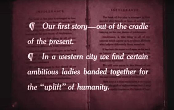
Image 1: Frame taken from the movie Intolerance (1916), which shows an example of expository intertitle with a creative visual composition.
Dupré la Tour (1995) additionally discourses about the strength of the written word in silent films, as opposed to the ephemeral nature of speech – which can be extended to graphic configurations in general, including not only verbal elements, but pictorial and schematic as well.
The written word is the visualization of discourse in a material space that is demarcated and practically permanent. Hence, it can relieve the human brain of the task of memorization by taking on the task of storing, conserving and transmitting information (…) The strength of the graphic image of language lies in its permanence and solidity. It can break out of spatial and temporal constraints by transmitting its content in graphic form, through its literally tangible materiality which is the very strength of writing. (Dupré la Tour 1995, 62)
Titles were undoubtedly the first form of graphic configuration noted in film history, be it through opening and final titles, or intertitles. The latter, unfortunately, have been considered ‘a necessary evil’ and discredited by many film theorists, regarded as palliatives for the absence of sound. Their main functions were to anchor and fix the meaning of the image in the viewer’s memory, providing landmarks which helped stage historical events and structure narratives. (Dupré de La Tour 1995). Hence, intertitles were an extremely effective graphic tool for reinforcing a film’s narrative interpretation and clarifying possible visual misconceptions.
The advent of sound
By the end of the silent period, the cinema had established itself not only as an industry but as the ‘seventh art’. None of this would have happened without technology, and cinema is in fact unique as an art form in being defined by its technological character. (Nowell-Smith 1996, 3)
Technological advances were crucial in defining cinema’s hybrid language, and the use of graphic configurations are directly related to the evolution of technology in the film industry, which reached a series of important breakthroughs – the first being sound technology. By the mid-1930’s, nearly all films produced in Hollywood, for instance, were ‘talkies’ – or all-dialogue films – marking the death of the silent film. This was a major milestone in the history of film, which changed the relationship between movies and its spectators, as well as film language itself. (Ministry of Cinema)
It is interesting to notice that even after the insertion of synchronized sound as a material of expression in film language, graphic configurations in the form of intertitles did not cease to exist. In fact, one of them did: the dialogue intertitle was quickly found obsolete and substituted by sound. Yet the expository intertitle still found its way in cinematic language. The circumstances changed, and filmmakers found themselves equipped with two powerful tools to transmit information besides the filmed image: sound and graphic configurations – one did not substitute the other anymore. The advent of sound in cinema paved the way for the graphic language to take on a new proportion as it became a choice whether to represent information graphically – allowing for its plastic and aesthetic functions to be reinforced. The fact that intertitles were not viewed as necessary anymore made their use more selective and creative, as opposed to the extremely functional aspect they initially acquired. In a certain way, this was a decisive moment to solidify the power and personality of graphic language in cinema.
As an attempt to synthesize the use of written words in film, Tietzmann (2007) defined five types of connections that have existed in cinema since the beginning of the twentieth century: opening credits, dialogue intertitles, expository intertitles, endogenous typography and final credits. The opening credits were originally limited to a simplistic nature, as they objectively informed the film’s authorship through copyright trademarks; the dialogue intertitles soon became obsolete with the advent of sound; the expository intertitles provided valuable information which only existed in the graphic dimension; the endogenous typography consisted of words that were part of the set (for example, a store’s name sign, writings in shirts, labels, tattoos, or props) and brought verisimilitude to the film’s universe; and at last, the final credits were limited to the words “The End” up until the 1960’s, when they eventually began to present the entire technical crew behind the making of a movie. Even though, once more, only the written word is taken into account, these connections can be extended to graphic design elements in their totality.
With this in mind, the established connections can be narrowed down, in terms of graphic configurations, into three main categories that are seen today in movies and represent the main functions of the graphic language in film: (1) filmed graphic objects, which would substitute and broaden the term endogenous typography, including not only the written word but other graphic elements as well, applied to props, signage, and logos; (2) opening and final credits, here condensed into one category, with the function of denoting the beginning and end of a motion picture as well as presenting the cast and crew; and finally (3) expository intertitles, which refer to any supplementary narrative information in the form of text and/or other graphic elements, that can be inserted in between scenes, but can also be superimposed over the filmed image, through post-production manipulation. The dialogue intertitle was eliminated from these definitions, since it became obsolete. The expository intertitle will further receive new additions to its scope, as a direct consequence of technological advancements – which will be explored in the next sections.
The American film industry and the shift to production design
Before moving any further, it is relevant to display a short overview of how the film industry was developing historically. Prior to the First World War, European film industries dominated the international market, with special emphasis to the French and the Pathé studio, who established offices in major cities around the world. They were seen as a dangerous threat to the American producers, since a large portion of films exhibited in the United States still originated in Europe. With the First World War, the currently unified European film movement was completely destabilized and Americans viewed this as an opportunity to establish their worldwide hegemony, instituting west coast’s Hollywood as its main stage. The Hollywood system operated as an integrated industry, controlling all aspects of cinema from production to distribution. Through Hollywood’s classical editing style, as well as its exploitation of the star system1, the American studio system rose to complete power, foreseeing what is now called the Golden Age of Hollywood. (Ministry of Cinema)
One might ask why is it critical, in terms of the graphic language in cinema, to acknowledge Hollywood’s ascension and stabilization in the international film industry. The answer lies in the sophisticated inner structures built by the industry’s professionals, aiming to establish consistent and collaborative departments in film production – including a solidified art department. The supervising art directors were head of the hierarchy, and managed the work of other art directors and unit members, such as set decorators, property masters, painters, carpenters, signpainters, scenic artists and specialty crafts people. (St. John Marner, & Stringer 1974, 49-60)
It is true that European film movements such as the German expressionism, the Italian neo-realism, and the French nouvelle-vague strongly contributed to art direction, in an attempt to challenge Hollywood’s predominance. (Barnwell 2004) However, it was in the United States, in 1939, that a major landmark was achieved in regards to the art department and the role of design in film. Producer David O. Selznick gave William Cameron Menzies the unprecedented title of production designer for the visual complexity of his work in the movie Gone with the Wind (1939). The original role of the art director was extended into the one of the production designer – and this represented much more than just a change in nomenclature.
His detailed visualization of Gone with the Wind incorporated colour and style, structured each scene, and encompassed the framing, composition, and camera movements for each shot in the epic film. Menzies’ contribution helped expand the function of the art director beyond the creation of sets and scenery, to include the responsibility for visualizing a motion picture. As a result of his extraordinary vision, William Cameron Menzies is recognised as the father of production design. (LoBrutto 2002, 2)
The work of the newly credited production designer, thus, became significantly larger in a movie production, taking in responsibility for the visual art and craft of cinematic storytelling. Evidently, this is not a one-man job, and to establish the look and style of a motion picture the production designer acts collaboratively with two other professionals – the director, as the central creative force, and the director of photography. Together they form what is called the Trinity (LoBrutto 2002, 6), and a film’s successful accomplishment will depend much on their good relationship and creative workflow.
Although the term production design was technically established in 1939, it took about thirty years for the industry to fully recognize and implement it altogether. There were constant misconceptions between the terms production designer, art director, and set decorator and often designers would be mistakenly uncredited. In European and South American countries, for instance, the term art director is preferably used even nowadays, as production design most commonly refers to higher budget productions – which at the time were mainly from Hollywood, who had the necessary funds to invest in it. The more a movie invests in production design, more elaborate is the screenplay in terms of visual metaphors, colour palettes, architectural and period specifics, locations, designs and sets. (LoBrutto 2002)
Baptista (2008, 1) refers to production design as a possible line of interdisciplinary research between design and cinema. The prevailing key point is on the term ‘design’, which in definition can be very broad considering its wide-ranging applications, but essentially compels a core quality common to all its subareas – the ability to connect distinctive elements into a unified and coherent visual project. This quality can be extended to the production designers, in the cinematic context, where they will bridge contrasting parts of a movie into a consolidated visual identity – thus becoming a key figure in the realization of a movie. The creative process behind any designer’s work will be based on the same core concepts, whether it is production, graphic, or motion design, for example.
Understanding the pillars on which production design is fundamentally based emphasizes the value of design in the film industry. It can be observed, through real-life cases, how having a background in design influences the way directors perceive a consistent visual universe for their movies. Alfred Hitchcock, one of the world’s instantly recognizable personalities of cinema, started his career as an advertising designer for the Henley Telegraph Company, moving on to become an intertitle designer for silent films in 1921, and a year later a set designer for six films in the newly formed Gainsborough Pictures. (Spoto 1977) Eventually, his abilities as a designer, understanding the components of a powerful visual image, were acknowledged through his ultimate accomplishment of becoming a feature film director. An important aspect of Hitchcock’s filmmaking method, which surely derives from his design background, is his total involvement in every aspect of the film’s visual conception, from pre-production with script breakdown and storyboarding, to production meetings with set, costume and title designers, to post-production editing and special effects. This is why Hitchcock has said that his films are ‘finished before shooting begins’, and his actors have the impression that he has already seen the whole film in his head.
The design of a Hitchcock film, then, is really a series of interconnecting designs – the careful locking together of various parts: sets, props, dialogue, costumes, characters, plot and above all theme, that deepest area of ideas and concerns for which there is no verbal equivalent, and to which the visual image most clearly points. (Spoto 1977, para. 11)
The story before the story
Hitchcock’s work as a designer-turned-director is frequently linked to one graphic designer, possibly the most famous of the film industry, who revolutionized the creative potential of opening titles. Saul Bass was an extremely important figure in the history of graphic design in film, since he was the first professional in the industry to look at opening titles with different eyes. Until the 1950’s, most titles were limited to functional aspects and had the sole intention of marking the beginning of a movie, presenting the film’s title and main staff. Creatively speaking, they were minimally explored and told little information about the subsequent narrative. Bass’s contribution was in the idea of creating ‘a movie inside a movie’, where the opening credits would set the mood and express the following story through visual metaphors in the form of simple animations. In an interview done in 1996 with Pamela Haskin, Saul Bass said:
I began thinking about what to do at the beginning of a film. Obviously, the point of any title is to support the film. (...) My initial thoughts about what a title could do was to set mood and to prime the underlying core of the film’s story; to express the story in some metaphorical way. I saw the title as a way of conditioning the audience, so that when the film actually began, viewers would already have an emotional resonance with it. (Haskin 1996, 10-17)
Bass used basic elements of graphic design, such as geometric shapes and typography – frequently hand-drawn – to represent complex visual narratives. Essentially, Bass had a minimalistic approach to design and perhaps this is why his creations became so relevant in the history of design and film, due to the originality of its form. He also became known for his film posters, where he reproduced the visual identity created in the opening titles, only in static form. Bass worked directly with famous filmmakers such as Alfred Hitchcock, Otto Preminger, and later on in his career, Martin Scorsese, together with his wife Elaine Bass.
It is meaningful to mention that Saul Bass also had experience in corporate logo design, being responsible for creating many iconic and long-lasting visual identities, such as Continental Airlines and AT&T. Interestingly, logo design was much more profitable than his film work, and that is why eventually he ended up prioritizing corporate design over the film industry. But the similarity between the two can be seen in his work.
Saul said that a film symbol is like a company logo but with a shorter life to do its work. A film symbol still had to attract, and like a record cover or book cover, had to nonverbally express the essence of the movie (…). Thus he ‘invented’ the film symbol and film credits accordingly. The design of the film symbol and credit before the film started told the mood of the story before the story. (Petit 2014, para. 2)
Bass creates an extraordinary analogy, which is reiterated in this paper, of the movie as a logo, symbol, or even as a brand. Through a strong graphic element in the opening titles, such as the illustrated hand in The Man with the Golden Arm (1955), or the spirals in Vertigo (1958), a motion picture, in all its narrative complexity, can be recognized simply by a graphic symbol – just like the whole universe of a brand, tangible or intangible, can be recognized by an individual logo. Designer Steven Heller, in his acclaimed book Design Literacy, refers to Bass’s creations for The Man with the Golden Arm poster: “Rather than hype the film, the graphic reduced the plot, the story of a tormented drug addict, to an essence – a logo really – that evoked the film’s tension.” (Heller 2004, 222)
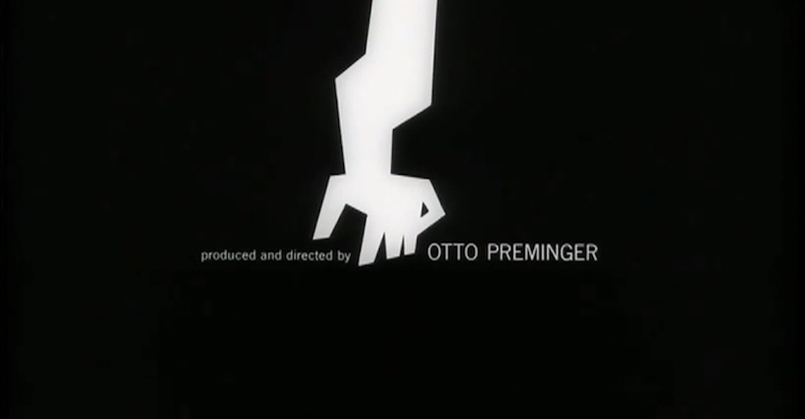
Image 2: Frame taken from Saul Bass’ opening titles of the movie The Man with the Golden Arm (1955).
Bass’s legacy has reverberated all over modern and contemporary cinema, influencing many title designers and bringing visibility to the practice of graphic design in film. His prestige is largely due to opening titles, which have become increasingly more complex in terms of the quality of the graphics and the narrative itself. “Saul Bass’s contemporaries Pablo Ferro and Norman McLaren were equally seduced by the seventh art, widening the use of graphic language in film and becoming the forerunners of Kyle Cooper, the designer responsible for the opening of Seven (David Fincher, 1995).” (Aragão 2006, 32, free translation)
In short, opening titles are an essential component of a film, and the only necessary graphic one. Minimally, in terms of graphic language, every movie must have opening and final credits. It is up to the Trinity to decide whether these will be more visually elaborate or simple and straightforward. The main issue to keep in mind, though, is the fact that the opening titles are only one possible manifestation of the graphic language in a filmic narrative. They are often mistakenly considered as the only cinematic graphic design configuration, and this is observed through the vast amount of academic work from designers on this subject. However, as has been shown throughout this historical investigation, there are other forms of graphic configurations that contribute to a film’s design, which should not be disregarded – such as the filmed graphic objects and expository intertitles.
The rise of computer graphics and digital cinema
Following the creative boom of opening titles, pioneered by graphic designer Saul Bass in the 1950’s, the next twenty years in the film industry were defined by clashes in hegemony from North American and European productions. As a response to a weakened traditional studio system due, in part, to Europe’s new wave upturn, a new generation of filmmakers emerged in the United States, brought up on television and foreign cinema. This period was commonly referred to as New Hollywood, where the American industry saw itself forced to adapt to the practices of European cinema, that went beyond the previously established classical method. Narratives became more sophisticated in representing realities, with characters who were now confused and not as clearly motivated as before, and American censorship was re-evaluated as more amounts of sex and violence were portrayed in motion pictures. (Ministry of Cinema)
This shift was embodied in much through the growing phenomenon of ‘blockbusters’, which were highly lucrative, high budget feature films with popular worldwide releases and computer-generated special effects. At this point, cinema’s core structure was experiencing an internal revolution, where its original foundations – the filmed image – acquired a new digital and graphic dimension, manifested through the use of computer graphics, as opposed to the traditional optical and physical-mechanical special effects used in earlier films. Movies such as Steven Spielberg’s Jaws (1975) and George Lucas’s Star Wars (1977) were avant-garde in the use of computer graphics and are, until nowadays, part of the worldwide pop culture. Besides, they also accompanied promotional merchandising design which reinforced their graphic identity and guaranteed their financial success as box-office hits. (Bordwell 2006, 3)
Hollywood was gradually establishing a solidified new film aesthetic, through bigger control of all aspects of the image. Reality was displayed as a result of the latest technology available in the film industry. The digital revolution allowed for computers to be inserted into the cinematic process as major tools for editing and image manipulation techniques – which increased exponentially the possibilities of film production. “Not only special effects, but all the manipulative potential of computer-generated images allowed for the creation of artificial sceneries, digital colouring of old films, three-dimensional animations, and electronic graphics.” (Aragão 2006, 40, free translation) These behavioural changes in cinematic nature particularly reinforced the capabilities of filmmaking in alliance with technology, which dictated the rhythm of film production since early ages and affected the way film language progressed and was perceived. “Digital media redefines the very identity of cinema. (…) When, given enough time and money, almost everything can be simulated in a computer, to film physical reality is just one possibility.” (Manovich 1995, 1)
Manovich (2001) defines the new principles of digital filmmaking, which include characteristics such as live action footage functioning as “raw material for further compositing, animating and morphing.” The result is a new kind of realism, synthesized into a metamorphic nature with the following equation: digital film = live action material + painting + image processing + compositing + 2D computer animation + 3D computer animation (Manovich 2001, 301). With this assumption, several layers are now added into the film spectrum, transforming the cinematic language into a more complex and ever evolving web of elements. Manovich makes a pertinent comparison between the current digital cinema and its early ages, when manual construction and animation of images were explored through analogue techniques. He suggests that digital cinema is an evolution of early cinema’s animation and painting technology and even considers digital cinema as a sub-genre of painting, in order to reach its plasticity. Curiously, the world’s first fully painted feature film was released in 2017, validating, to a certain extent, Manovich’s theory. The movie Loving Vincent (2017) tells the story of the well-known troubled artist Van Gogh, through the unprecedented use of oil painted frames. Filmmakers Hugh Welchman and Dorota Kobiela recruited 125 oil painters from 20 countries to paint roughly 65,000 canvas using a frame-by-frame animation technique, similar to stop motion. The ambitious film took nearly six years to be finished and was nominated for a Golden Globe for best animated feature. During the production process, they shot the original performances of the actors on a green screen at 12 frames per second and edited it regularly as a live-action film. Afterwards, they broke it into shots and the artists had to paint frame by frame in the style of a Van Gogh painting. (Giardina 2017) The result is a poetic and breath-taking visual account that leaves the spectator in awe from beginning to end.
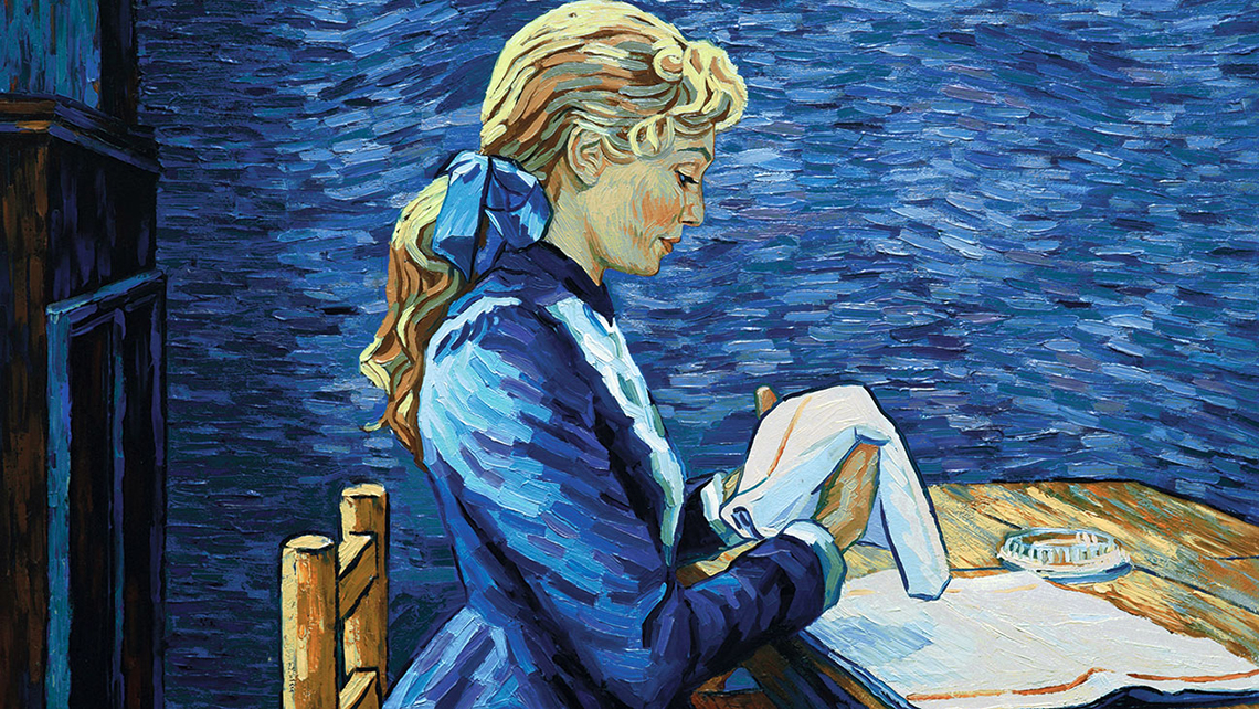
Image 3: Frame taken from the movie Loving Vincent (2017) which shows the final outcome of an oil-painted frame, based on the live-action original footage.
It is in this context of endless digital possibilities that cinema’s essence starts to be questioned, as theorists criticize or at least try to grasp the extent of the consequences caused by the digital revolution, especially in Hollywood. Theorist William Brown even suggests the concept of a ‘post-humanist’ cinema, which explicitly opposes the original idea identified by the French in the 1940’s, of films as faithful representations of reality2.
…the mix of ‘real’ and ‘virtual’ elements, even on the level of colour, suggests a cinema that is no longer an indexical representation of a reality that existed before the camera (even if that ‘reality’ was part of a ‘fictional’ world, i.e. a set), but rather a new, post-humanist reality, which possesses a new ontology that similarly raises questions about our old, ‘human’ reality. (…) In other words, digital cinema is a cinema that can be made without cameras and it is a cinema that can be made without human characters or even actors. (Brown in Buckland 2009, 70-71)
The extensive innovations also led to the emergence of movements such as the Dogme 95, led by Danish directors Lars Von Trier and Thomas Vinterberg, who sought to return to the traditional values of story, acting and theme, excluding the use of elaborate technological special effects. Even so, it was clear by this moment that a film’s graphic language was directly affected by the advent of digital media, making it much easier to create graphic configurations and to mix them with the original footage. Opening and final credits and expository intertitles, from this moment on, are mostly created by computer software in the post-production stage. Filmed graphic objects can be either handmade, or created with computers, depending on their ultimate objective. The birth of the world wide web, the emergence of increasingly powerful computers and the release of editing and animation software, such as Adobe’s After Effects and Premiere, are key factors which led to the search of graphic designers to work in film, in much through the field of motion graphics. (Aragão 2006) Nevertheless, the concept of digital cinema should not be taken to the extreme, since contemporary films cannot be generalized to image manipulation and special effects. It is evident, though, that the digital revolution brought closer together the graphic and cinematic languages, as it allowed for graphic configurations to be more consistently explored in a filmic universe.
Contemporary cinema and Hollywood
Through some examples shown along film history, the authenticity of design in cinema can be perceived, be it through the role a designer can take in the production of a movie, as well as through the insertion of graphic design elements in a film’s fictitious world. The possibilities for design in cinema go beyond the repeatedly referred title design, and extend into other areas such as production, graphic, motion, typography, among others. Considering the new metrics of digital filmmaking defined by Manovich (2001), a designer must be up to date with the latest technologies and understand how graphic design can be adapted onto a screen, exploring new visual grammars brought by the virtual medium and the concepts of motion and time.
Likewise, movie directors must expand their mindset by including design principles as foundations for their audiovisual projects. The straight relationship between director–designer should be explored consistently in film productions, where graphic, motion and digital designers have creative autonomy in the movie’s visual project. Contemporary Hollywood cinema has shown some great examples of directors that already present this concern, such as Wes Anderson, who is famous for displaying meticulous aesthetics for his movies. In his major production The Grand Budapest Hotel (2014), Anderson hired lead graphic designer Annie Atkins to produce all of the movie’s diegetic graphic identity. Atkins created all filmed graphic objects – as print, signage, and fictitious logos – which helped establish the visuals of the fictional land of Zubrowka, where the story is set, and thus making it believable.
Image 4: Example of a graphic prop created by designer Annie Atkins to help build the visual world of Zubrowka, in the movie The Grand Budapest Hotel (2014).
(Source: Annie Atkins’ official website)
Atkins gave a series of interviews regarding her graphic design work in the film, where she reinforces the importance of establishing the correct time period and setting for the movie. When it comes to period pieces, the amount of research dedicated into creating the props is valuable, to avoid misleading aesthetics. The graphic objects need to transport the viewer to the chosen era in a natural and believable manner; thus, graphic design elements should be ‘invisible’ in the sets, functioning as accessories to build the diegetic universe of a film. Rather, the focus should be on the story that unfolds as a central plot. On another note, however, these filmed graphic objects can also tell subliminal stories of their own, integrated into the central plot. For example, in the opening scene of the period movie Bridge of Spies (2015), a man is being chased in the New York subway. The spectator can notice a sign that says “Walk do not run”, which brings irony to the sequence, as the characters will immediately start to run in search of the man. The sign, which was also created by Annie Atkins, adds a new layer of perception to the scene, bringing information that can only be read by the attentive viewer in the graphic dimension.
It is important to consider the different formal natures that graphic configurations acquire in movies. The three mentioned categories – filmed graphic objects, opening and final credits, and expository intertitles – are manifested through two major forms: physical and virtual. For instance, graphic props have a physical form, as they are constructed manually or mechanically, to be inserted inside a set and possibly interacted by the actors (unless they are digitally constructed). They are part of the film’s diegetic world and help set the scene and time period. On the other hand, opening and final credits, as well as intertitles, will most likely have a virtual form, being created and visualized through a computer software, in post-production. The distinct formal natures bring a flexibility to graphic configurations, which can adapt to the realities of movies – be them more realist and physical, or formalist and virtual3.
In regards to virtual graphic configurations, another sub-area of design that has grown in film for the last years is of UX/UI (user experience and user interface), through the creation of digital user interfaces in a filmic narrative. They are mostly explored in science fiction movies and suggest how technology would work in the future. These digital interfaces are completely hypothetical and often non-functional, serving as symbolic representatives for a futuristic technology. The basis for creating these interfaces undoubtedly come from graphic design elements and principles, however, these elements need to be transformed into responsive, moving images, and this is where the dimensions of motion design and UX/UI design are inserted in the equation.
In Minority Report (2002), production designer Alex McDowell worked together with scientists and other designers to create a stunning futuristic aesthetic, but also recognizable by the contemporary audience. The cutting-edge technology seen in the film is said to have influenced and made possible many contemporary technologies, such as gestural interfaces, flexible displays, voice activation, driverless cars, and wearable technology. Much of the movie takes place in a futuristic city designed entirely by McDowell in great detail in the pre-production stage. This style of work can be seen through much of the designer’s filmography, where he calls his holistic, design-led approach, “world building”. (Machado 2011, 108-119) This concept is effective in creating filmic universes which, even though fantastic, are believable by the audience.

Image 5: Frame taken from the movie Minority Report (2002) which shows the use of a digital user interface.
Last but not least, another virtual form of graphic configuration is given through graphic animations which are superimposed over the filmed image, as a means of filmic expression. They can represent any additional information to the plot – as did the silent film’s intertitles – and are usually included as a way to make a story more fast-paced and dynamic, thickening the plot. The graphic animations have a distinct formal nature from the realistic cinematographic image, and are instantly recognized as elements exterior to the movie’s universe, therefore, their use should be very cautious as to not become too abrupt and decontextualized from the film’s language. An interesting application of graphic animations exist as social media language. Considering the contemporary scenario of the Hollywood films, occasionally graphic configurations take the form of social media elements, as seen through smartphone screens – such as text messages, “emojis” and digital interfaces which simulate Instagram, Twitter, Facebook or other social media platforms. One example is of the movie Chef (2014), which uses Twitter’s graphic language in a comical way so as to represent the impact that social media can have in a person’s life and business. This strategy works effectively in bringing a technological and up-to-date feel to the movie, as well as approaching younger generations, who most likely will identify with what they see on screen.

Image 6: Frame taken from the movie Chef (2014) which shows the use of a graphic animation through Twitter’s social media elements.
Besides the expository intertitles, therefore, other virtual configurations exist in contemporary movies, in the form of digital user interfaces and graphic animations. With this in mind, the previously defined category of expository intertitles can be expanded into (3) expository graphics and intertitles, so as to include all of these possibilities. They are condensed together into one category because they have the same intention or function of conveying additional information in the graphic dimension, through graphic design elements which are exterior to the film’s diegesis.
Conclusion
Moura (2004, 102-108), in his Master’s dissertation, defines two main possibilities for the practice of design in cinema, which is pertinently applied to this paper’s conclusion. The first is horizontal, and considers the designer as an interlocutor, contributing with the director in the creation of a movie. This function can be attributed to the production designer, or art director, and reinforces the ability of the designer to materialize ideas, combining the practical aspects of production with the abstract qualities of planning and conceptualizing. The second insertion is vertical, and considers the designer as executor of specific tasks throughout a movie production, such as designing the opening titles, graphic props or virtual configurations. In this situation, the designer works in an isolated and minimized manner, responding to higher professionals – as opposed to the horizontal insertion, where he will be part of those higher professionals.
Ultimately, the contemporary film industry sees countless possibilities for designers, integrated into an increasingly collaborative crew. These designers can come from different backgrounds, such as motion, graphic or UX/UI design, as long as they present the necessary skills to create such elements, through the use of computer-generated software or through analogue methods. The specialists are part of either the art department, responsible for creating the set design in pre-production stage – which includes all the graphic props used in the filming; or in the post-production department, integrated with the visual effects department, in order to combine the graphic animations and titles with the movie’s editing and final outcome. It is true that designers can also work in other functions related to the distribution of a movie, such as creating promotional posters and merchandising graphic pieces – but these are extensions of the movie’s graphic identity, which should adopt the same language in its construction. Additionally, designers can work together with illustrators or concept artists in the pre-production stage in order to create storyboards or other concept arts.
Furthermore, the historical timeline of graphic design in film allowed for the understanding of how graphic design elements have always co-existed with other components of film language since the beginning of silent cinema – initially through titles which further on developed to become the three main functions identified as (1) filmed graphic objects, (2) opening and final credits and (3) expository graphics and intertitles. The advent of digital technology and computer graphics allowed for graphic configurations to become more complex, as well as easily manipulated into a contemporary filmic narrative, which approximated the graphic and cinematic languages. It expanded the range of options available for a filmmaker, as well as increased the financial revenue of film production – in much through growing reliance on blockbusters, sequels and remakes. Hollywood was certainly the industry that explored to the fullest these structural changes, dominating the cinema market, from mainstream commercial to truly independent productions. In terms of visual projects, therefore, one can find the most varied collection of filmic narratives in Hollywood’s contemporary scenario, with countless graphic explorations. The strong presence of production design and increased digital technology makes Hollywood, accordingly, a pertinent context for this research. However, it is important to note that the graphic language can be present not only in Hollywood but in any type of cinema around the globe – it is precisely due to its flexible behaviour that it can function as a powerful film component.
In conclusion, the graphic language should be inserted in a filmic visual narrative through a conscious and strategic use, which is only possible with the deepened knowledge of the theoretical aspects of the languages that compose cinema’s hybrid nature. Alongside, whether a movie intends on solely recreating reality or presenting a stylized visual interpretation of reality, the graphic language works through flexible approaches – be them in the physical or virtual form – with the objective of reinforcing the movie’s own concept of reality, conveying meaning and triggering emotions.4
Final notes
1Hollywood’s star system privileged actors’ photogenic physical beauty as it centralized the narrative on the actor as the ‘star’ of the movie.
2Around 1945, when film language was still being discovered and structured, the French film theorist André Bazin argued that the goal of cinema was to represent the real world with the greatest commitment to realism. He advocated the use of wide shots, long takes, with the camera at eye level and limited editing, so as to create the perspective of a person observing the events.
3If one considers the filmmaking spectrum as a horizontal line, on the left end lies realism, as opposed to formalism, on the far right end. These two tendencies were best represented by the French filmmakers working in the earliest days of cinema. On the realism side there were the Lumière brothers, making films that were static shots of real-life events. On the formalist side there was George Méliès, telling highly stylized stories with elaborate sets, costumes, and special effects, with no interest in imitating reality.
4This paper is part of the research of the Master’s dissertation entitled “Design & Cinema: an analysis of the graphic language as a narrative strategy in Hollywood’s contemporary films”, completed in 2020 at ESAD Matosinhos.
Bibliography
Aragão, Isabella. 2006. A Dimensão Gráfica do Cinema: uma proposta de classificação de suas configurações. Master’s dissertation. Universidade Federal de Pernambuco. Recife, Pernambuco.
Baptista, Mauro. 2008. A pesquisa sobre design e cinema: o design de produção. Revista Galáxia, 15
Barnwell, Jane. 2004. Production design: architects of the screen. London, New York: Wallflower.
Bordwell, David. 2006. The Way Hollywood Tells It. Berkeley and Los Angeles: University of California Press.
Brown, William. 2009. Man Without a Movie Camera – Movies Without Men: towards a post-humanist cinema? In Buckland, W. Film Theory and Contemporary Hollywood Movies (pp. 66-85). New York: Taylor & Francis.
Chisholm, Brad. 1987. Reading Intertitles. Journal of Popular Film and Television. 15, 3. 137-142
Dupré La Tour, Claire. 1995. The Written Word and Memory in Griffith’s Intolerance and Dreyer’s La passion de Jeanne d’Arc. Iris: A Journal of Theory on Image and Sound. 19.
Giardina, Carolyn. 2017. How Loving Vincent Created the Animated Film in Van Gogh’s Iconic Style. Retrieved August 17, 2019, from https://www.hollywoodreporter.com/behind-screen/how-loving-vincent-created-animated-film-van-goghs-iconic-style-1067364.
Gunning, Tom. 2006. The Cinema of Attraction: Early Cinema, its Spectator and the Avant-Garde. In Strauven, W. (ed.) The Cinema of Attractions Reloaded (pp. 381-388). Amsterdam: Amsterdam University Press.
Haskin, Pamela. 1996. “Saul, can you make me a title?” Interview with Saul Bass. Film Quarterly (ARCHIVE). 50, 1. 10-17.
Heller, Steven. 2004. Design Literacy: Understanding Graphic Design. New York: Allworth Press.
LoBrutto, Vincent. 2002. The Filmmaker’s Guide to Production Design. New York: Allworth Press.
Machado, Ludmila. 2011. Design e Linguagem Cinematográfica: Narrativa visual e projeto. São Paulo: Blücher.
Manovich, Lev. 1995. What is Digital Cinema?. Retrieved from July 25, 2019, from http://manovich.net/index.php/projects/what-is-digital-cinema.
Manovich, Lev. 2001. The Language of New Media. Cambridge: MIT Press.
May, Julia. 2010. The Art of Film Title Design Throughout Cinema History. Retrieved July 10, 2019, from https://www.smashingmagazine.com/2010/10/the-art-of-the-film-title-throughout-cinema-history.
Ministry of Cinema. n.d.. Cinema’s Birth to Modern Day – A Timeline of World Cinema [YouTube Channel]. Retrieved April 15, 2019, from https://www.youtube.com/playlist?list=PLRtzd5eoxQ17k7Z7J6aMxY9Rzk4J1L3Cq.
Moura, Pedro. 2004. Microcinema: o impacto das novas tecnologias digitais sobre a produção audiovisual. Master’s dissertation. PUC-Rio, Rio de Janeiro.
Nowell-Smith, Geoffrey. 1996. The Oxford History of World Cinema. New York: Oxford University Press.
Petit, Zachary. 2014. When Saul Bass Met Hitchcock. Retrieved July 20, 2019, from https://www.printmag.com/imprint/saul-bass-hitchcock/.
Spoto, Donald. 1977. Hitchcock The Designer. Print: America’s Graphic Design Magazine. XXXI:IV. Retrieved from https://www.printmag.com/featured/alfred-hitchcock-designer/.
St. John Marner, Terence, & Stringer, Michael. 1974. Film design. New York: A. S. Barnes and Co.
Tietzmann, R. 2007. Como falava a tipografia do cinema mudo. E-Compós, 10.
Filmography
Bridge of Spies. 2015. From Steven Spielberg. United States / Germany: Walt Disney Studios / Motion Pictures / 20th Century Fox.
Chef. 2014. From Jon Favreau. United States: Open Road Films.
Gone with the Wind. 1939. From Victor Fleming. United States: Loew’s Inc.
Intolerance. 1916. From D. W. Griffith. United States: Triangle Distributing Corporation.
Jaws. 1975. From Steven Spielberg. United States: Universal Pictures.
Loving Vincent. 2017. From Dorota Kobiela and Hugh Welchman. Poland / United Kingdom / United States: Altitude Film Distribution/Next Film.
Minority Report. 2002. From Steven Spielberg. United States: 20th Century Fox / DreamWorks Pictures.
Seven. 1995. From David Fincher. United States: New Line Cinema.
Star Wars. 1977. From George Lucas. United States: 20th Century Fox.
The Grand Budapest Hotel. 2014. From Wes Anderson. United States: Focus Features.
The Man with the Golden Arm. 1955. From Otto Preminger. United States: Columbia Pictures Corporation.
Vertigo. 1958. From Alfred Hitchcock. United States: Paramount Pictures.