Abstract
The presence of the written element in cinema goes back to the early silent movies era, to express meanings that were not enough comprehensible just through images. The use of text charts as means to support and to implement narrative almost invariable consisted of black cards with centered white type (rarely the opposite, i.e., black type on white boards), occasionally utilizing graphic features as ornaments.
These letterings inserted between scenes, either before or after to which they referred, sometimes had a deranged narrative effect because of interrupting the action flow. But words, when added to the cinematographic image, can indeed communicate certain abstract concepts such as date time lapse, local; evince characters speeches; describe some action not performed in the movie.
This paper aims to investigate the change of status of the written element as an accessory apparatus to a central and structural element of the movie, specifically in the experimental and avant-garde cinema, considering Marcel Duchamp’s Anémic Cinéma (1926) its inaugural example.
The incorporation of textual elements can be understood within the very process of the visual arts in the first decades of the twentieth century since Braque’s Gueridon (1913) and Picasso’s Bottle of Vieux Marc, Glass, Guitar and Newspaper (1913) through the Cubist and the Dada conceptual and formal strategies.
The Conceptual art of the sixties and seventies permeates expressions of film experimentalism that will be analyzed for its use of text condition, where Michael Snow’s So this is, already in early 80ies (1982) is to be highlighted.
Keywords: Avant-garde, Conceptual Art, Dada, Experimental Film, Text and Typography.
Image and text
The intentional merge by the vanguards, from the beginning of the 20th century, between media and art institutions, will incorporate the ‘other’ of the press, of advertising and of design – not yet fully defined in its principles, which will happen at the Bauhaus (1919-1933). Therein, the boundaries between visual and literary expressions will be broken.
The definitive rejection of one of the foundations of Western painting since the Renaissance of the quattrocento – in which the flat surface of the canvas is an imaginary transparency, through which we see, and therefore the painting presents an illusion of the perceived reality – will be performed by Braque and Picasso. In its place we will almost have a reversion to a medieval point of view, in which a pictorial image is a symbol, and its relation to reality is conceptual. The reality of nature is replaced by the reality of art. The autonomy of art will demand independence from nature.
The eye and the mind – this conflict, contemporarily, must favor the mind; which means the absorption of language in the artwork. The eye, by itself, is unable to penetrate into an intellectual system that today distinguishes objects that are and are not works of art. If, therefore, the perceptual experience of the eye is no longer reliable, then the work of art can no longer just be described as an object (restricted to dimensional, material and compositional characteristics), causing a displacement of the ‘art object’ to the ‘idea of art’.
In a chronological approach, Braque and Picasso’s inaugural Cubism represents the founding 20th century art movement of interest to these issues. On the one hand, it is still through the ‘traditional’ techniques of art, such as the pencil and the brush, that the elements of the art world will be constituted. On the other hand, through collage, which emphasizes the two-dimensional reality of the surface, there will be an enrichment of the paradoxes involved in the cubist dialectic between art and reality, false and true.
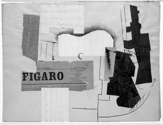
Figure 1 - Pablo Picasso, Bottle of Vieux Marc, Glass, Guitar and Newspaper, 1913. Collage and pen and ink on blue paper, 46.7 x 62.5 cm. Tate Modern, London
In the post-war period, from the mid forties on, the discussion about the ‘artistic potential’ of design changes: instead of the art x design dichotomy, much of the conscious art of the media will incorporate advertising and mass communication strategies.
A non-linear process is observed, in which the letter, an element imported from a universe foreign to art, meaning idea, thought, information, communication, becomes the protagonist, elementary matter of art.
Thus, this article seeks to point out the direction from which this research originates – in the analysis of experimental films in which verbal expression, figured by typography, is a constitutive and intrinsically fundamental element to confer the very status of work of art itself.
And this analysis seeks to recognize meanings in the choices of use of the typographic element within the paradigm of the two poles of modern creation: ‘expressionism’ (understood as expression and authorship in art, as subjectivity, and not as artistic movement) and depersonalization.
In principle, we do not aim to impose a restriction on the scope of the objects of analysis that is determined by the technical nature of the means of their production.
It is precisely interesting to develop a critical analysis of what we will consider ‘artist’s project strategies’, adopted in each of the selected works. It is investigated the meanings contained in the specificity and criteria of the artists’ formal choices – in what are favored aspects of typographic ‘drawing’, ‘origin’ and ‘medium’ – on account of endowing them with intentional meanings.
However, according to Panofsky (p. 32), the artist intention cannot be determined absolutely. It is impossible to define intentions per se with scientific precision, as these are conditioned by the standards of the time and the environment in which they are created: a cosmos of culture, a space-time structure.
Nevertheless, it is possible to define an ‘optics for evaluating these intentions’ through the commitment to a mental process, of a synthetic and subjective character, remaking the actions and recreating the creations. Hence, it is not a matter of assembling a rational superstructure, but an interpenetration between the recreational synthesis and the archaeological investigation, which qualify and rectify mutually.
Text and Typography
Yet, the object of the recreational experience requires – to be described – terms that imply generic theoretical concepts. In this sense, for this analysis, our approach will also employ the constitution of particular classes that belong to the typographic culture and repertoire: design, origin and medium, and the theoretical foundation of the parameters that define them and their history.
This reconstructive terminology will describe peculiarities like what bears witness to artistic ‘intentions’, and intentions can only be formulated in terms of alternatives. Then, the peculiarities of the works will be interpreted as specific solutions to ‘artistic problems’.
Understanding the process of inserting typography into art, and the search for identities that differentiate meanings requires a historical and anthropological approach to the production of material culture. In this perspective, the advent of the press is our cornerstone, marking in the West, in the middle of the 15th century, in the transition from manuscript to print, a revolution in communication. At the intersection of technical restrictions and aesthetics, letterpress printing will create its own values of excellence. Whether in the strategy at the service of legibility, and of beauty, in the full sense of the term in art, with its masters, their styles and their evolution of taste.
The determination of this point of reference, precisely due to the technological advent, becomes a question that defines principles, for it is from that the imposition of the notion we want to deal with: the use of the letter whose design is part of a system1.
Anémic Cinéma, a foundation stone
In 1926, Marcel Duchamp2 produced Anémic Cinéma which title contains an anagram, almost a palindrome3, visually stressed in the opening of this 6 minutes short. The visual symmetry between the words anémic and cinéma is emphasized in the chart, where white capital letters form a perspective with one vanishing point on a black background, for the two words converge on an imaginary vertex with their corresponding respectively last and first letter (C), and the following letters to compound each word are slightly progressively enlarged downwards on a widening angle to form the shape of a virtual triangle.
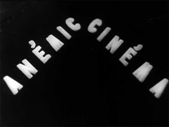
Figure 2 - Opening of Anémic Cinéma, 1926
Duchamp starts his word gaming already from the titling, since “anemic” in French is anémique, which written expression would not typographically function towards the desired symmetry. This sort of maneuver will be further used within some of the textual film charts.
Vertigo and Hypnosis
In Anémic Cinéma – the only experiment Duchamp made with film as an author –, abstract optical whirling graphic circles and spirals – entitled Rotoreliefs4 – alternate with spinning texts in French, Duchamp’s mother language.
These texts are a sort of spoonerisms; single interplays of homophone words making up nonsense sentences that convey alliterations5 and rhyme, within the dada and surrealist tradition poetry. The humor comes from the confusion of meanings, since we have to deal with both: difficulty in following the significant itself, for the frequent cacophony, and understanding the very semantics of the sentence.
We are lead to an immersion that bears hypnosis through the phenomenological effect of different centrifugal and centripetal whirlpools – the two dimensional black and white geometric compositions create an illusion of depth for the right speed they are spun. Nevertheless, there is a recurrent snap that ‘wakes us up’ from that spellbinding state, when complex spinning sentences make their way by a dry cut.
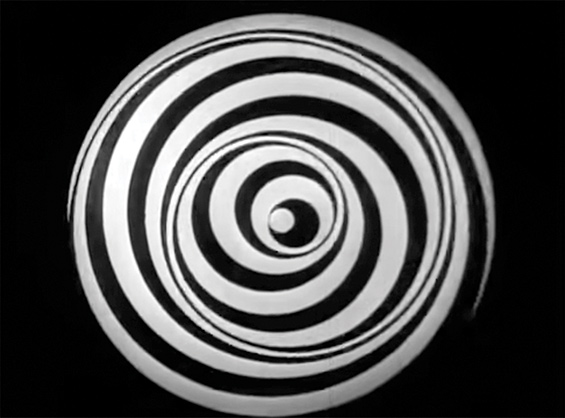
Figure 3 - Anémic Cinéma, Rotorelief, 1926
The systematic and mathematical even time split of these two diametric sorts of images sharply interchange without any transition, interrupting each other, obliging the spectator to switch his/her mental buttons, back and forth, from pure visual perception experience to an intellectual effort to get some coherent understanding of the writings contents.
“… Anémic Cinéma derives from the recognition that by and large the cinematic experience during the silent period was one of an alternation of reading and looking at images in an illusionistic depth (…) for every image there is a verbal passage or between every two images, a title.” (Sitney 1979, 102).
For the written compositions, white shallow 3d capital letters are applied on the surface of flat black discs on a quite precise spiral layout, in a loose type kerning between the words, beginning from the edge of the disc towards its center. The choice of a sans serif typeface is meaningful, conferring a paradoxical non-subjective appearance to the verbal content, for the divested industrially produced letters and austere artwork.
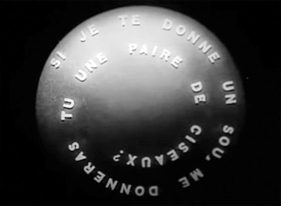
Figure 4 - Anémic Cinéma, one of nine spinning texts discs, 1926
The ‘backstage’ apparatus devised to spin the discs is precisely pivoted on their center back and there is not a moving camera6 – on the contrary, its steadiness on a tripod or similar device is required to guarantee the desired cinematic effect. If one is to observe this filming in the set, will have before him two devices looking at each other.
A static lens complements the static camera – there is not a single zoom to aid the reading of the never-ending circular moving texts, but it is strategic that mechanically they all move counterclockwise (when some of the Rotoreliefs move clockwise), therefore, allowing us to its reading. The ‘eye of the lens’ is focused on the center of each disc (all of them, both abstract and textual) with the same framing, where the whole circle is within the screen, in its very limit, on the upper and lower borders. Duchamp retrieves the grammar of the ‘proto-cinema’ of Marey’s chronophotographic gun7 for his screens portray shooting targets.
But besides the counterclockwise movement and a constant and relatively comfortable speed, no gimmick was developed to facilitate the reading of the sentences. The fact they are complete throughout the whole time of each projected textual disc is of no assistance, on the contrary, is dispersive. After many attempts of capturing the full text of each scene – yes, it can be said that each text and each geometrical composition is a scene – we figure that the best strategy for that purpose consists of fixing our look on a narrow field of vision on the superior center of the screen8.
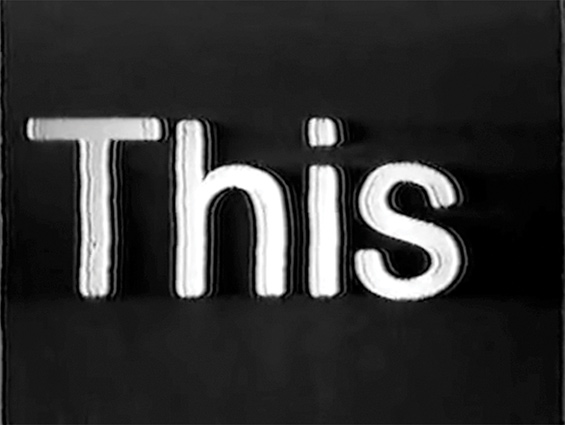
So is this, Michael Snow
So is this (1982) deals with the opposite reading scheme of Anémic Cinéma. For about 50 minutes we are presented with a text to be read, each word at a time, soundless. It is a film because shoot and edited and projected as so, since its minimalist resources match it, technically and formally, to the early beginning of cinema, silent and black and white text charts. As Snow makes explicit along the film: “This was handwritten then it was typeset then filmed and now it is light reading… This is a shot on the dark… a screen in the night”.
… a kind of semiotic play (a film that is writing, a writing that is presented as moving picture),… language and film functioning as a perfect double mirror or reciprocal mise en abyme for the two media. (Pethö, 82)
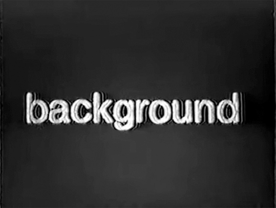
Figures 5 and 6 - So this is, Michael Snow, 1982
Like in Hollis Frampton’s Zorns Lemma (1968), each word’s chart is not a still photograph or a mechanical shot under an animation stand. Snow is not in search for a sharp and good finish by means of some virtuous technicality in producing this long sequence of single words scenes. The camera seeks centralizing each ‘word-image’ within its visual field, generating slightly unsteady, blurred and convex results.
In a certain way, similar to Paul Sharits’s T,O,U,C,H,I,N,G (1970), So is this also warns the audience of the approaching end of the screening, when displaying these last words:
This
film
will
seem
to
stop
As Scott MacDonald wrote in Film Quarterly, in 1985, few years after the making of So is this (1982), “few filmmakers have had as large an impact on the recent avant-garde scene as Canadian Michael Snow, whose Wavelength is probably the most frequently discussed “structural” film.”
Fifteen years separate these two films…
Back to Duchamp
The total of nine text discs verbal expressions follow in their original, in French, and their corresponding free translation into English, by the author:
- Bains de gros thé pour grains de beauté sans trop de bengué.
Baths of coarse tea for grains of beauty without too much bengay9. - L’enfant qui tète est un souffleur de chair chaude et n’aime pas le chou-fleur de serre-chaude.
The child who suckles is a blower of hot flesh and doesn’t like the cauliflower of the hothouse. - Si je te donne un sou, me donneras-tu une paire de ciseaux?
If I give you a penny, will you give me a pair of scissors? - On demande des moustiques domestiques (demi-stock) pour la cure d’azote sur la Côte d’Azur.
We ask for domestic mosquitoes (half stock) for the cure of nitrogen at Côte d’Azur. - Inceste ou passion de famille, à coups trop tirés.Incest or family passion, too many shots.
- Esquivons les ecchymoses des Esquimaux aux mots exquis.
Dodge the bruises of Eskimos with exquisite words. - Avez-vous déjà mis la moëlle de l’épée dans le poêle de l’aimée?
Have you already put the marrow of the sword in the stove of the beloved? - Parmi nos articles de quincaillerie paresseuse, nous recommandons le robinet qui s’arrête de couler quand on ne l’écoute pas.
Among our lazy hardware items, we recommend the tap that stops running when you don’t listen to it. - L’aspirant habite Javel et moi j’avais l’habite en spirale.
The aspirant lives in Javel and I have lived10 in spiral.
We might say that it is not possible to deliver a perfect translation from French to all sentences for, besides their nonsense logic and sometimes subliminal erotic messages, there are also some linguistic plays such as une paire de ciseaux, instead of the correct ciseaux. This is a parody of its correspondent in English that is a compound word – “pair of scissors”.
As Remes (2015) puts, if the Rotoreliefs were the only content of Anémic Cinéma, it would be a compelling abstract film in the tradition of Walter Ruttmann’s Lichtspiel Opus [Light Play Opus] (1921), Hans Richter’s Rhythmus 21 [Rhythm 21] (1921) and Viking Eggeling’s Symphonie diagonale [Diagonal Symphonie] (1924).
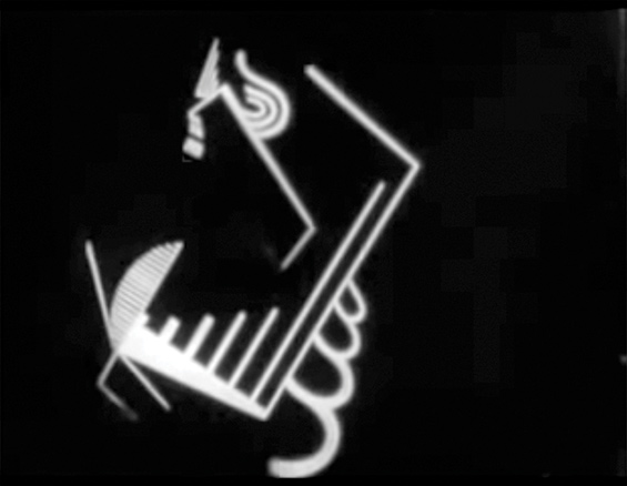
Figure 7 - Frame of Symphonie diagonale, Viking Eggeling, 1924
And yet, the centrality of written text in Anémic Cinéma challenges the widespread notion that imagery, whether abstract or figurative is the only visual film resource.
The surrealist poet Robert Desnos published film criticism regularly during the 1900s. In 1923 he devoted an article to “Music et sous-titres”. He saw the title as an integral part of the art of the cinema. “Everything that can be projected on the screen belongs in the cinema, letters as well as faces. All means are good when they produce good films, and it is in the mind that the quest of purity must occur rather than in a subsidiary technique.” (Sitney 1979, 102)
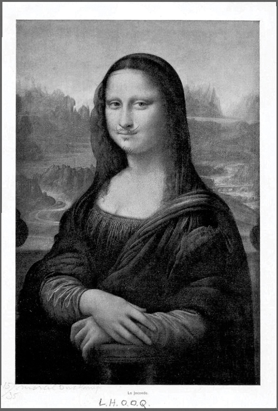
Fig 8 - Marcel Duchamp, L.H.O.O.Q., 1919. Pencil on postcard
The title is the key
L.H.O.O.Q.
Anémic Cinéma presents a quality of charade already present in Duchamp’s former work L.H.O.O.Q. (1919). This objet trouvé11 [found object] is a postcard of a cheap reproduction of Leonardo da Vinci’s Mona Lisa, where below the image, centralized, we can read La Joconde, its French title version, onto which Duchamp drew a moustache and beard in pencil and appended the title.
Here, the word play is within the title of the work itself, from the composition of the letters of the apparent acronym. When read in sequence – the name of each of this acronym’s letters (in French) – it will sound like: “Elle a chaud au cul” [“She is hot in the arse” or “She has a hot ass”], which is a jocose iconoclasm towards the most paradigmatic portrait of a lady in the western art history.
The resemblance of an acronym is given by the use of capital letters, each followed by a period, designating the abbreviation sign. That remark may seem irrelevant, but perhaps LHOOQ would not be as effective to the intended reading.
T,O,U,C,H,I,N,G
Paul Sharits uses commas in-between the letters of T,O,U,C,H,I,N,G, the title of his 12 minutes experimental film (1968). This way of writing, with the use of capital letters and commas, instead of periods, resembles a typo acronym. This textual expression foreshadows the structure of film itself; where each of the letters that forms the word “touching”, appear in sequence. Its permanence on the screen lasts for a very short time, almost as a flicker – in fact, the movie is a succession of flickers, either of images or solid color frames or, in this case, type. The upper case letters T, O, U and so forth work as some kind of metrics spaced throughout the film, and once the letter N shoes up, one figures it is not far from its ending. The commas are, therefore, graphic signs in this almost logotyped title, which represent the scenes in-between the letters. Hypothetically, Sharits could have assigned his film title to upper and lower case letters writing, but its representational correspondence with its content would not have the same verisimilitude.
An alter ego’s authorship
In this same ‘spirit’, the last film frame is a manual and calligraphic signature by Duchamps’ alter ego, Rrose Sélavy, also a pun, since, in French, the letter “r” is pronounced er, sounding “Eros, c’est la vie” [“Eros, that’s life”].
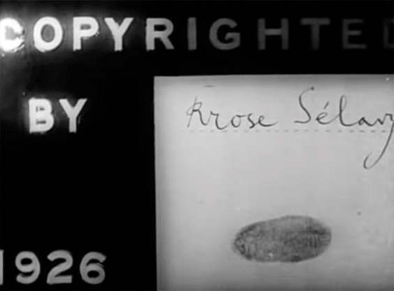
Fig 9 - Copyright by Rrose Sélavy, 1926.
Last frame of Anémic Cinéma
The manuality of the handwriting diametrically contrasts with its background – the impersonality of something between a billboard and a film slate. To confer more ‘authenticity’ to the signature, a fingerprint is added. That poses a whole discussion of authorship in art; an issue triggered by Duchamp around one hundred years ago that remains a minefield. Not to forget that some expressions of film terminology are frame, screen, from the visual arts repertoire.
To be continued…
For the effectiveness of this article, a narrow scope of examined films is proposed and many indisputable references, among which Zorns Lemma is a spotlight, are just mentioned. Hollis Frampton’s film definitively deserves an extensive elaboration for every time of watching, a new ‘synapse’ is unveiled.
Many further developments are to be explored in a continuation of Discours, Figure, d’après Lyotard, where we recognize many more approximations as well as diversities between Duchamp’s and Snow’s modi operandi in their respectives Anémic Cinéma and So this is.
The understanding of the hand writing in its multiple variations calls for more investigation: when intending to be calligraphic, or rough; pretending not to be handwritten, disguising its handicraft; or admitting personal expression is a whole issue to be analyzed as the mechanically and optically produced texts.
Notas Finais
1It is a fact that, before the press, in the Middle Ages and beginning of the Renaissance, the well-trained scribe was able to reproduce eight to ten different styles of writing. Each style was precisely defined and ‘stored’ in human memory for specific uses. Sacred scriptures, legal documents, literary novels, business and personal letters required differentiated scriptures. The press will bring the idea of a system in the technological sense.
2With the technical help of Man Ray and Marc Allégret.
3Coincidentally, in 1969, Hollis Frampton titled Palindrome to a 16mm movie which epigraph is a palindrome in Latin: “In Girum Imus Nocte Et Consumimur Igni [By night we go (down) into a gyre/and we are consumed by fire]. He used wasted both ends of the rolls of processed films – abstract imagery that incorporate the principle of the mirrored ends to the center (color, silent, 22min).
4Earlier, in 1920, Duchamp had made his first optical kinetic machine – Rotary Glass Plates. He used to call “play toys” this sort of mechanical art. These hypnotic-spinning discs became iconic symbols of the mind’s turnings, appearing in films like Jean Cocteau’s Blood of a Poet (1930) and Hans Richter’s Dreams that Money Can Buy (1947).
5Evident repetition of consonant sounds in successive or close associate syllables within a group of words.
6In “Structural Film” (326), a chapter of Film Culture Press, written in 1969, Sitney develops the concept of structural film, by identifying its four characteristics, where a fixed camera position stands as one of them.
7In 1882, Étienne-Jules Marey invented what is an ancestor of the movie camera that could shoot 12 images per second. Its denomination is a reference to its great similarity to a normal rifle, with grip, canon and rotating drum.
8Almost seventy years later, in So is this, Michael Snow will operate with the opposite procedure, where only one word appears on the screen at a time.
9Pain relief therapy cream developed by a French doctor, Jules Bengué.
10Other possible version would be: The aspirant lives in Javel and I had the coat in spiral.
11Objet trouvé is an art procedure that consists of granting the status of art to appropriated objects or products that would not be considered art, through undisguised, but usually modifying actions.
Filmography
Anémic Cinema. 1926. Marcel Duchamp. France.
Lichtspiel Opus [Light Play Opus]. 1921. Walter Ruttmann. Germany.
Rhythmus 21 [Rhythm 21]. 1921. Hans Richter. Germany.
So is this. 1982. Michael Snow. Canada.
Symphonie diagonale [Diagonal Symphonie]. 1924. Viking Eggeling. Germany.
T,O,U,C,H,I,N,G. 1968. Paul Sharits. United States.
Zorns Lemma. 1970. Hollys Frampton. United States.
Bibliography
Bershen, Wanda, 1971. “Zorns Lemma” in Artforum, September: 41-45.
Butor, Michel, 1969. Les mots dans la peinture, Geneva: Skira.
Chion, Michel, 2017. Words on Screen, New York: Columbia University Press.
Corrigan, Thimoty, White, Patrícia and Mazaj, Meta, 2011. Critical Views in Film Theory, Boston: Bedford/St. Martins’s.
Lyotard, Jean-François, 2011. Discourse, Figure, Minneapolis: University of Minnnesota Press.
MacDonald, Scott, 1985. “So is this”, in Film Quaterly, vol. 39: 34-37.
Panofsky, Erwin, 2001. Significado nas artes visuais, São Paulo: Perspectiva.
Pethö, Ágnes, 2011. Cinema and Intermediality: The Passion for the In-Between, Newcastle upon Tyne: Cambridge Scholars Publishing.
Remes, Justin, 2015. Motion(less) pictures: the cinema of stasis, New York: Columbia University Press.
Sitney, P. Adams, 2000. Film Culture Reader, New York: Cooper Square Press.
------, 1979. “Image and Title in Avant-Garde Cinema”, in October, vol. 11: 97-112.
------, 2002. Visionary Film - the American Avant-Garde, 1943-2000, New York, Oxford University Press.
Tylski, Alexandre, 2008. Le générique de cinéma: histoire et fonctions d’un fragment hybride, Toulouse: Presses Universitaires du Mirail.